Imagine squashing a glorious Rembrant into a matchbox. A horrible thought! But when we display works of art in tiny rectangles on a website, we inevitably reduce and distort them.
The Problem of Scale
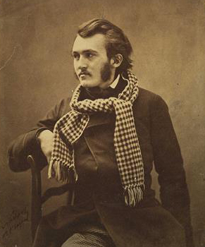
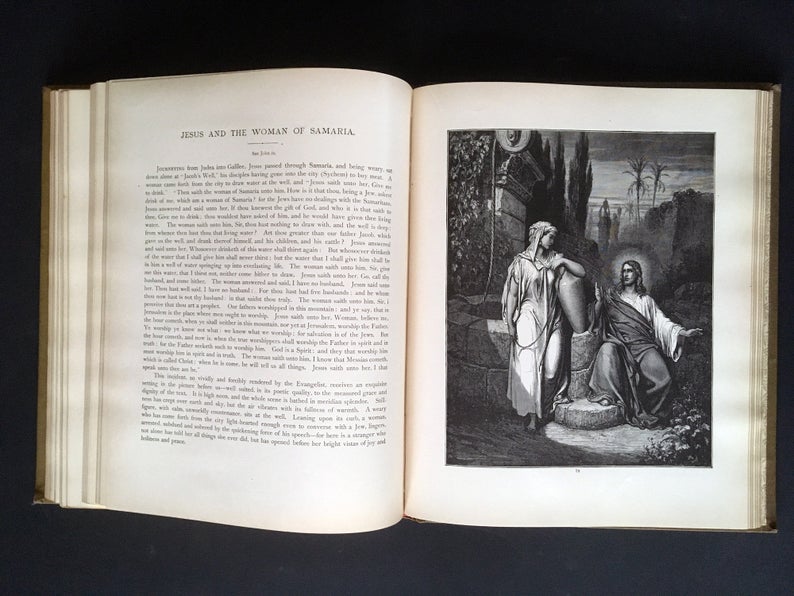
I vividly remember encountering The Black Prince at Crécy, by Julian Russell Story while visiting one of our clients, the Telfair Museums in Savannah, GA. Not only is the The Rotunda Gallery of the Telfair Academy an impressive room, but this painting at 143 1/2 × 212 1/2 inches takes up almost half of an entire wall.
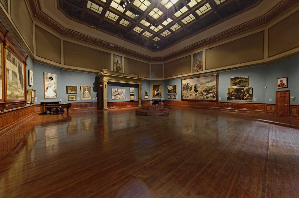
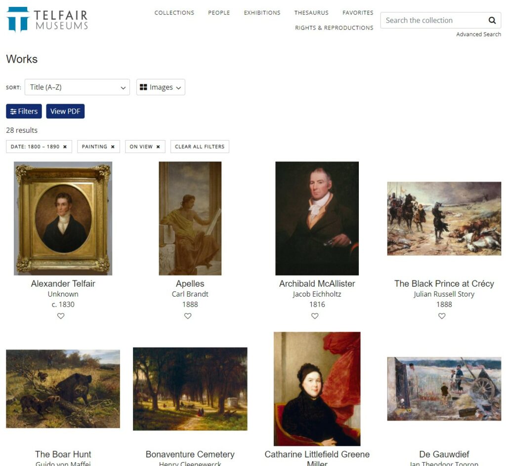
You have to physically walk the room to fully take this painting in. Here’s the same massive painting in the context of the online collection’s presentation. It’s the last one in the first row. It actually appears smaller than the portrait next to it.
There’s just no way to replicate the impact of seeing artwork in real life on a website. The problem of scale will always be a problem—though there are some ways to at least suggest scale, such as this solution from on the Leiden Collection website.
But scale is not the only problem when framing artwork on a museum website.
Varying Proportions in Listing Grids
There is also the problem of listing images with differing proportions and orientations. Every piece of artwork in a collection has its own fixed width and height, some oriented in a vertical “portrait” mode and other in horizontal “landscape” orientations. Displaying images in a fixed grid layout can create serious problems.
In the example above, from Telfair’s eMuseum collection search, the solution was to keep each individual object’s proportion by varying the scale to fit them within the listing grid. The technical term for this approach is to “contain” the images within the grid squares. This is probably the best default solution, but it does exacerbate the scale problem, and it also makes for an uneven grid.
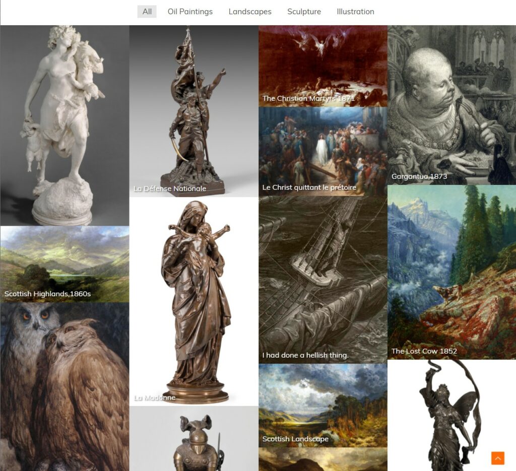
Another grid layout option, that avoids the cropping problem, is the use of a “masonry” layout. Here’s an example of a masonry layout that we used in our Dore Demo page.
Masonry layouts stretch columns and rows and alter the overall scale of images to fit them into a flexible arrangement that preserves the proportions and orientations of each item.
Masonry grids do avoid the cropping problem, but they don’t always fit into the overall design aesthetic of every website. And they are not ideal when other data associated with images is also presented—such as the artist’s name, date, dimensions, and so forth. Fixed grids are more readable when both the image and it’s information are being displayed together.
Other Listing Contexts
While maintaining proportions is a good option for a collection search, there are other contexts where art works get displayed in fixed grids—such as in blog post listings, event lists, or on archive pages. In such contexts images are typically set to a fixed size box. And to avoid uneven layouts images are usually set to “cover” the full width (regardless of its dimensions). Squashing a vertically oriented portrait, for example, into a horizontally fixed listing grid can cause some unfortunate decapitations!
Solutions for Cropping Issues
Beheadings, and other cropping issues can be solved by using a custom cropping plugin such as the aptly named “Crop Thumbnails.”
In order to use a plugin like that you’ll need to understand something about how WordPress handles images. When you upload an image to the WordPress Media Library, WordPress generates a set of corresponding images at different sizes, thumbnail (150×150), medium (300×300), medium large 768 x 0, and large (1024×1024). Various themes and other plugs may add other custom sizes for their purposes as well. (And you can make your own custom thumbnail image sizes using a plugin like Simple Image Sizes.)
When a page template calls for an image, like the default blog listing page template for example, the code can be set to call for one of the smaller thumbnail sizes. After all, you wouldn’t want to cram a 1024 x 1024 image down into a 150 x 150 thumbnail. That would unnecessarily increase the page’s load time since every thumbnail would download a full size file. Better to opt for the smaller thumbnail version of an image in that context.
The Solution to Blurry Images
By the way, if you’ve ever encountered the problem of uploading a large image to a page, yet it shows up blurry, it’s almost always due to the code calling for one of the smaller thumbnail sizes, so that the browser has to upscale the low resolution version into a full size display, thus making the image blurry. Most themes are designed to call for the best image size for each theme page layout. But some custom themes allow image size selections to be made manually, and in those cases you have to select the right thumbnail size when adding an image to a page. If you choose a large thumbnail for a small display, you’ll be slowing down the page. If you pick a small thumbnail for a large display, it will be blurry.
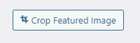
Back to the custom cropping plugin. When you have Crop Thumbnails installed you’ll see a “Crop Featured Image” button when you open your images in the Media Library. This brings up a window that shows all the available thumbnail sizes that can be custom cropped, with a crop setting tool on the right. When you set a custom crop, that cropping will be used wherever that particular image size is being called by the theme or in an image’s settings.
Note that when you don’t see your crop take effect, it’s usually due to one of two things. Either the image size being called by the code does not correspond with the thumbnail size you cropped, or it might be correct but your browser may have cached the previous image with it’s original crop. To force any page to fetch the latest version of your images, try this trick – just append a question mark to the end of the page’s URL and then add any random characters to it. A question mark in a URL indicates a new parameter prompting the server to make a fresh request for the page and its files (rather than reloading from your browser’s cache).
Full-Width Image Layouts
Grid layouts are not the only problem when displaying images on a website. Often images are used as full-width backgrounds. Full-width images do create dramatic and immersive presentations. Browser windows, however, don’t have a fixed and consistent width. Computer screens can be set to a variety of resolutions and proportions. On wide monitors a browser can be narrowed or widened at will. Mobile devices change width and orientation with the simple rotation of the device. And so, while the width of a full-width image will expand and contract, usually the height of these sections are fixed. And so when an image is set to “cover” the full-width (which is the typical setting), the overall cropping of the image will vary dramatically.
In these cases you can’t entirely depend on a custom cropping. You have to pick images carefully, ones that favor a horizontal landscape orientation to begin with, and in which the focus of the image is emphasized within a relatively narrow horizontal band.
That’s because as a browser window containing a fixed-width image expands, the top and bottom crop will narrow down. The image’s top and bottom details will push off screen.
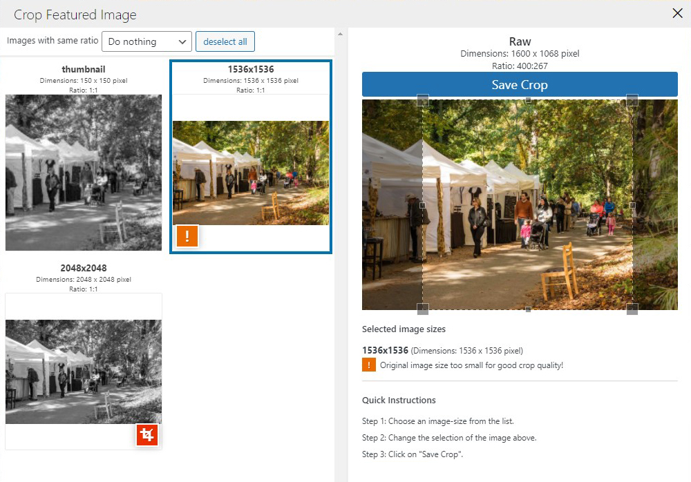
So, for example, the following image would work very well as a full-width background image. Since “the action” of the image is contained within a narrow horizontal band. So as a browser window widens, and the image narrows further and further in from top and bottom, you would still see the essence of the image within the central horizontal band.
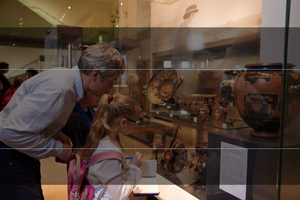
On the other hand, this example would be a poor choice for a full-width image, since it’s vertical orientation, and relative “dead space” in the middle would end up just showing a blank wall.
Displaying artwork on a museum website requires careful attention to detail, and planning for the various ways in which your images will be displayed in various contexts. There are all sorts of options for managing these difficulties, but using the right ones depends first on understanding the issues, and their possible solutions.