Every museum is unique. Each has a specific collection that no other museum can claim and the stories about this collection drive its brand. Museums have teams of employees solely devoted to creating a rich tapestry of information, research, and resources reinforcing the brand for their patrons. However, the visual way your museum and its stories are presented online can be just as influential in relaying your brand as all of this content.
Previously, we’ve encouraged museums to take a chance and create a unique visual brand on their website. However, finding and establishing a specific aesthetic is a daunting task, to say the least. How do you pinpoint the visual language that will become a seamless extension of your museum’s identity? Where do you start? How do you ensure it will back your brand’s messaging? In this post, we will discuss a series of collaborative exercises we use during our Museum Design Workshop to facilitate your museum’s journey to define the unique voice of your website.
Establishing a Visual Vocabulary:
Ask any design team, nothing is less helpful than hearing the feedback, “that’s not it but I’ll know it when I see it.” Without establishing a baseline set of terms (or worse, misusing terms), the design process can often stall out and become more like throwing darts rather than refining the design through collaboration. However, if you have the necessary tools to both give and receive feedback and constructive criticism, it’s much easier for the designers and museum leadership to arrive at the desired brand aesthetic.
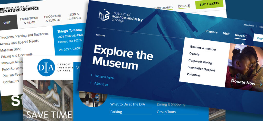
Before we ever begin to layout any design elements, the first exercise of our in-person workshop establishes a common toolkit of terms to ensure both teams understand the joint visual vocabulary. To kick things off, we present a glossary of descriptive terms, each paired with a set of varying existing museum sites that our team feels best exemplify those descriptors. For instance, take a look below at a slide from this exercise. We’ve grouped together a set of sites we feel best depicts the term “minimal”.
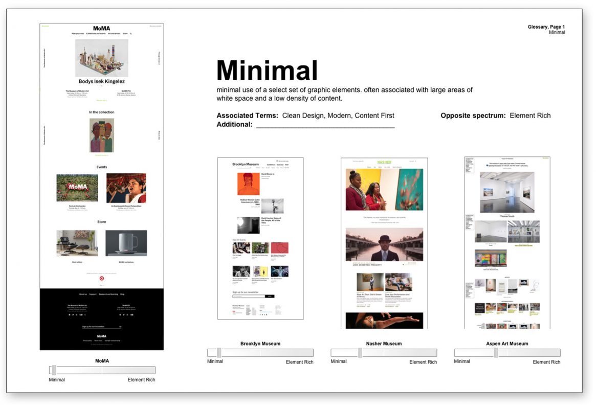
You will notice that we’ve included additional words that might be used to describe that same aesthetic we defined as minimal. “Clean design”, “modern”, and “content first” might fit better depending on how a specific museum would describe the same visual feeling, but we might need to add another term to this list based on the internal vocabulary of the museum. To establish the degree of minimal design, we’ve also included a descriptor that we feel best exemplifies the opposite end of the spectrum from our visual representation of “minimal”. In this case, we’ve defined its as “element rich” or “design heavy” and each site we’ve shown can be plotted on a spectrum between “minimal” and “element rich” to also determine the degree of which the site fits these term. Seeing how each team reacts and plots sites along our set of spectrum terms helps both groups to speak the same language and will lay the foundation for constructive design feedback.
Plotting your Desired Aesthetics:
While we feel each of the sites shown in this exercise represents a well designed and beautiful site, together they cover a vast range of design aesthetics and styles. By referencing dozens of sites plotted across several spectrums, a museum team will not only begin to define their visual vocabulary, but also can explore specific likes and dislikes and mark where on the spectrum where their brand might fit. After reviewing the spectrum showing sites ranging from “classic” to “edgy“, it’s very easy to start honing in on the particular point on that spectrum that feels most like your museum’s voice. For one museum, that brand aesthetic might be just a touch past the mean and land in “edgy” just between the MALBA’s site and MCA Chicago (as seen in the spectrum example below)
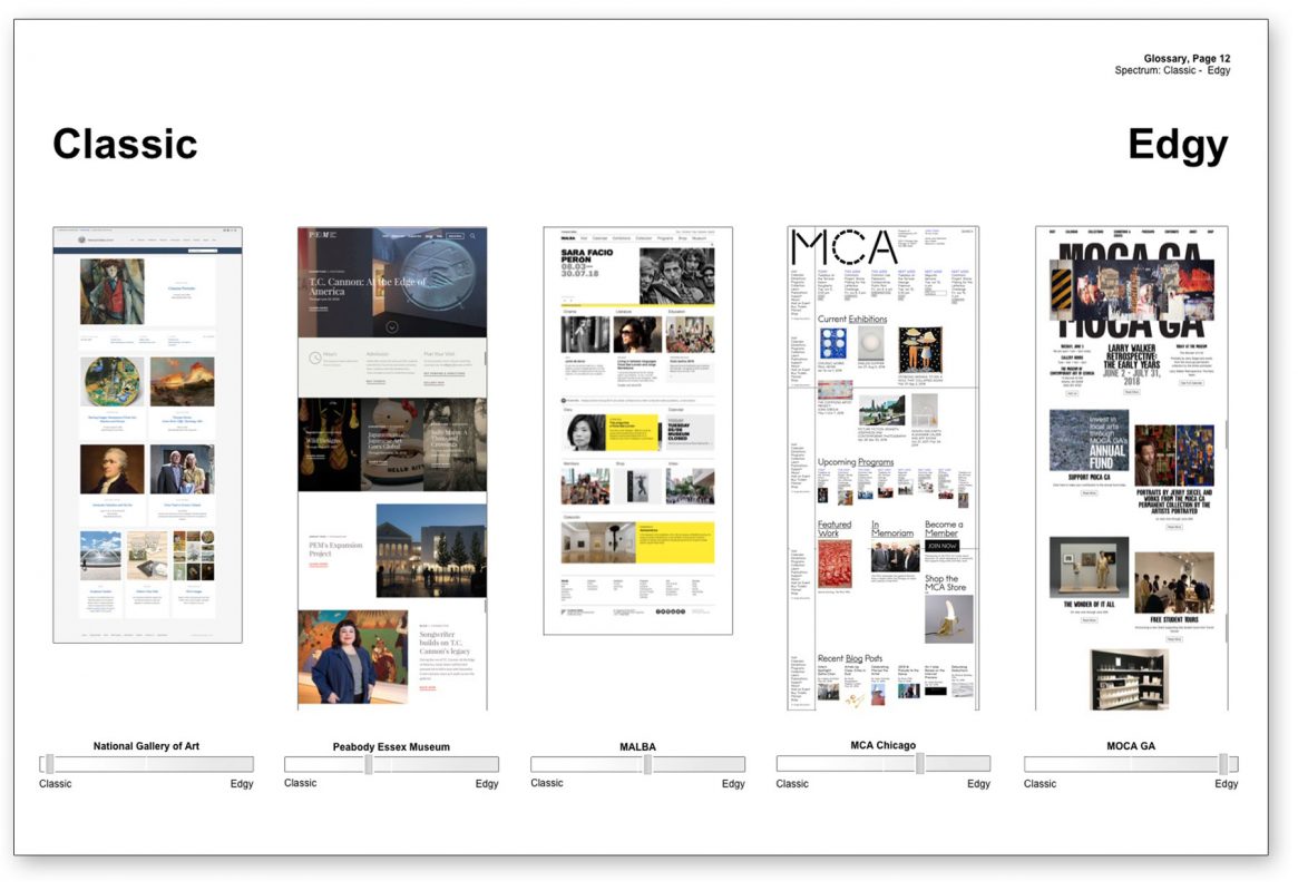
By using a wide variety of sites that cover every point of the spectrums between our set of design terms, both teams can discuss the museum’s aesthetics using a common language and explore where their brand aesthetics might fit in relation to those spectrums.
Reviewing your Current Site and Sites You Aspire to Be:
Now that we have a set of terms, as well as some of your own aesthetics, plotted out on those spectrums, it’s time to review your current site. Now armed with a shared understanding, let’s see where it fits on these spectrums in relation to some of the desired spots you’ve already discussed. We know you might not like your current site at all (that’s obviously why you are redesigning it) but it’s good to hear how it is received based on these same terms and spectrums. This way we can begin working on the new design without making any assumptions about your previous site as well as not repeating any of the same mistakes.
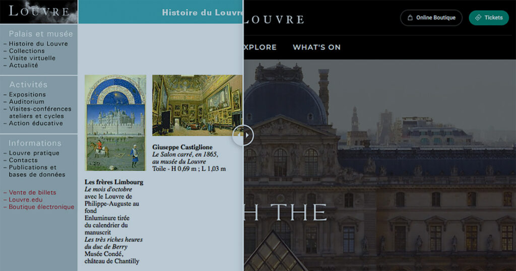
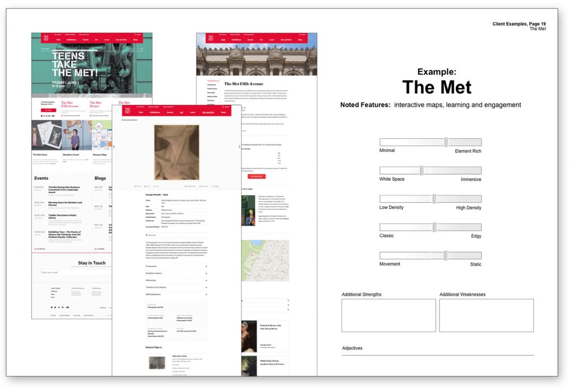
We finish up the spectrum polling by evaluating those inspiration sites and/or industry leaders in your space (or that you have placed in the “sites we like” category). Learning how you might plot these sites is not only important so we can confirm certain preferential aesthetics but also so our teams can isolate those aspects that you feel work against your brand aesthetic. I’ve included a workshop example below of a joined polling of The Met’s site for reference.
Isolating Design Elements:
For the most part, our workshop thus far has dealt with the overall brand aesthetic of the sites we’ve reviewed. However, those specific feelings and tones are created from the implementation of hundreds of individual design decisions working together. So when the desired aesthetic is for “an elegant yet minimal site design, that encourages exploration of the art itself”, that design is achieved by the marriage of all the specific site elements working not only in specifically designed layouts (like a home or events page) but also limitless combinations of mix and match components utilizing the varying content types of the site.
Our final exercise takes an isolated and focused look at a select set of design elements and explores not only how these minutiae can aid the design process, but also how it will reinforce (or undermine) your brand.
Take something as small as your link or button styling. These smaller call-to-actions are incredibly important in the way your users navigate through your content but there are an infinite number of ways they can be styled. By focusing one discussion in this exercise on a composite of varying button/link styles, your teams will continue to tease out more about the brand itself while honing in on specific design elements earlier in the process.
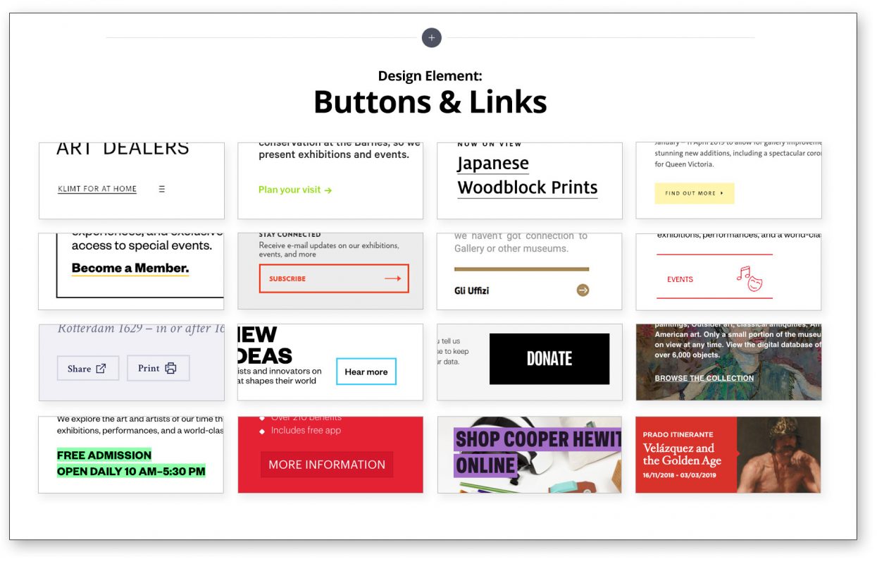
An exercise like this will also help to ensure that stakeholders won’t get hung up on specific design elements in early rounds of design options when feedback is so critical. If a particular individual can’t see past the placeholder photography used in the header images, that can derail the design process. However, if you know that the museum brand should focus on the way the art makes people feel, you will want to show engaged patrons interacting with each other and not stark photos of empty galleries. Discussing the options for a design element like photography at this stage will arm you with just another reinforcement of the desired brand identity in the initial mockups rather than creating a disconnect with first impressions from decision makers.
While the exercises in our Museum Design Workshop set the foundation for a very beneficial collaborative process, it’s also just the starting point to create a visual language that makes your museum’s brand unique. This design journey, when done correctly, is incredibly rewarding to both teams and will pay dividends for your museum and its online story for years to come.