One of the persistent challenges of museum website accessibility is that they have to serve “humans” in the broadest sense. Locals planning a Saturday visit. Teachers looking for lesson plans. Donors scanning for impact. Scholars chasing citations. And people navigating with screen readers, keyboard-only input, zoomed interfaces, voice control, or other assistive technologies.
Unlike many “nice-to-have” web features, accessibility is not optional, because it is not a feature at all. It is the ability to use the site.
There is a simple framing that helps cut through a lot of confusion:
Accessibility is for the users.
Not for your internal org chart.
Not for your web team.
Not for legal anxiety.
It is for real people trying to reach your content without fighting your interface.
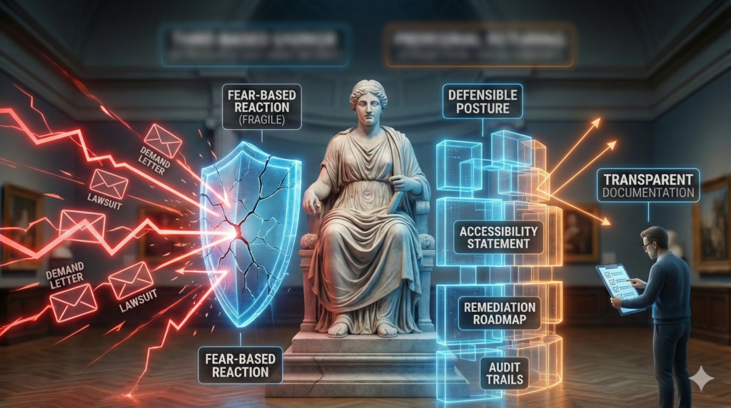
This framing matters because museum teams are often pulled into accessibility conversations that spiral quickly into abstraction or fear. Do we need WCAG 2.2 AA immediately or we are exposed? Can we install a plugin and be done? Does this mean every video, image, and PDF must be remediated all at once?
This article establishes the ground level. What baseline accessibility actually means for a WordPress museum website. What can be improved quickly. What tools can and cannot do. And how AI can reduce staff burden so accessibility does not become a permanent morale drain.
Baseline museum website accessibility answers the main question “Can I use this site?”
If you do nothing else, do this.
Open your museum website and try to use it without a mouse.
Use the Tab key to move forward through interactive elements. Use Shift + Tab to move backward. Press Enter to activate links and buttons. Use arrow keys inside menus when applicable.
If you cannot reliably reach the main navigation, open dropdowns, access search, move to the main content without tabbing through dozens of items, or see where focus is at all times, then the site fails the most basic accessibility test.
This is not an edge case. Keyboard access is a foundational requirement for many users, including screen reader users, people with motor impairments, and users navigating with alternative input devices.
Skip links that actually work
Skip links allow users to bypass repeated navigation and jump directly to the main content. They are one of the simplest and most impactful accessibility features.
The problem is that many WordPress implementations include skip links that only scroll visually. Keyboard focus does not actually move. From the user’s perspective, the link appears to work but functionally does nothing.
On a WordPress museum site, this usually comes down to template structure.
Your templates should include a clear main content landmark. The skip link should target that landmark. And the target must be able to receive focus so keyboard and screen reader users land in the correct place.
If you are using a page builder such as Elementor, this deserves special attention. Builders often fragment page structure in ways that make focus management inconsistent across templates unless it is intentionally handled.
WCAG Basics Without the Fog
When accessibility discussions feel overwhelming, WCAG is usually the reason.
It shows up as version numbers, compliance levels, and long lists of criteria that make accessibility feel like a regulatory maze instead of a usability problem. For museum teams, it helps to reset expectations about what WCAG actually is.
WCAG is not a checklist you memorize.
It is not a certification you install.
It is not a single switch that flips a site from inaccessible to compliant.
WCAG is a shared language for identifying barriers that prevent people from using websites.
The guidelines are organized around four principles. Content must be perceivable, operable, understandable, and robust. In practice, this translates into very practical questions. Can someone see or hear the content? Can they operate the interface without a mouse? Can they understand what is happening? Can assistive technologies reliably interpret the site?
The version numbers matter less than people think. WCAG 2.0 reflected a mostly desktop web. WCAG 2.1 added requirements for mobile use, touch interaction, low-vision needs, and cognitive accessibility. WCAG 2.2 further sharpens expectations around focus visibility, keyboard interaction, and reducing unnecessary friction.
These versions are additive, not replacements. A site that meets WCAG 2.2 AA also meets earlier versions by definition. That is why best practice is to reference the most current version when setting accessibility goals, even if enforcement policies lag behind.
The real confusion usually comes from the levels.
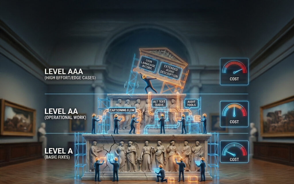
Level A is about not blocking access entirely. If a site fails Level A, some users simply cannot use it at all. Missing alt text, keyboard traps, unlabeled forms, or videos without captions fall into this category.
Level AA is where usability becomes realistic. Contrast requirements matter. Focus indicators must be visible. Navigation must be consistent. Error messages must be clear. This is the level most organizations should be aiming for because it aligns with real-world use and with how accessibility is typically evaluated in institutional and legal contexts.
Level AAA is aspirational. It includes requirements that are valuable but often unrealistic across an entire museum site, such as sign language interpretation for all video content or strict reading-level constraints that conflict with scholarly material. Even the WCAG authors caution against requiring AAA compliance site-wide.
For museum websites, the practical takeaway is straightforward. WCAG AA is not about perfection. It is about removing the most common and harmful barriers so people can reasonably use the site.
WordPress Reality: What the Platform Gives You and What It Does Not
WordPress has made real progress on accessibility. The core platform and modern default themes reflect an ongoing commitment to accessible markup and interaction patterns.
But a WordPress museum site is never just WordPress core.
It is a theme, often heavily customized.
It may include one or more page builders.
It almost certainly includes many plugins.
It includes custom templates, interactive features, and years of accumulated content.
Accessibility issues usually appear in the gaps between these layers.
A theme may technically support keyboard navigation, but a custom menu added later may not. A page builder may output correct headings, but editors may override them for visual reasons. A plugin may inject markup that assistive technologies struggle to interpret.
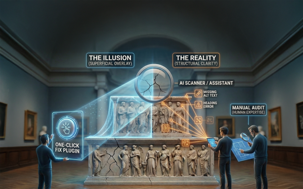
This is why accessibility cannot be solved with a single plugin.
Tools can help identify issues and patch certain recurring problems. They cannot restructure templates, rethink navigation logic, or enforce editorial discipline. Those decisions still belong to humans.
The most productive way to think about accessibility in WordPress is this: WordPress can support accessibility very well if it is designed and constrained intentionally. But if editors are given unlimited freedom to build pages however they like, accessibility will degrade over time. If templates and components are well designed, accessibility becomes easier to maintain.
Quick Wins That Actually Improve Usability
When we talk about quick wins, we are not talking about superficial fixes. We are talking about changes that significantly improve usability without requiring a full rebuild or major budget.
Focus Visibility
One of the most impactful examples is focus visibility. Keyboard users rely entirely on focus indicators to understand where they are on a page. Many WordPress themes remove focus outlines because they are perceived as visually distracting. This is often done globally with a single line of CSS.

Restoring visible focus styles is a small technical change with an outsized museum website accessibility payoff. It does not require rethinking content or retraining staff. It simply requires prioritizing usability over aesthetic minimalism.
Ordered Headings
Headings (indicated in HTML with H1, H2, … H6 tags) are another area where small discipline pays off. Screen readers use headings as navigation landmarks. When headings are skipped, misordered, or replaced with styled paragraphs, the page becomes disorienting. This is common in builder-driven WordPress sites.
The fix is editorial, not technical. Headings are structure, not decoration. Designers must ensure heading styles look good so editors are not tempted to misuse them. When Cuberis builds custom themes for our museum clients we always provide some global font styles which match the H1, H2 styles without actually using those HTML entities. This enables clients to display font sizes according to context, while reserving the actual underlying html heading for proper semantic usage.
Color Contrast
Contrast should be handled at the system level. If accessible color pairs are defined globally and enforced through design tokens or theme styles, editors cannot accidentally introduce low-contrast text. If arbitrary colors are allowed everywhere, contrast failures are inevitable.
Form Labels
Forms deserve special attention because they are where users most often abandon tasks. Missing labels, vague error messages, and inaccessible validation logic are common. Choosing an accessible form plugin helps, but configuration and testing matter just as much as the tool.
ALL CAPS
One often overlooked content issue is the use of ALL CAPS TEXT. Some screen readers may interpret all-caps text character by character, spelling it out instead of reading it as a word or phrase.
The solution is simple. Write text in normal upper and lower case, and use CSS styling to display it visually in uppercase when needed. This preserves readability and avoids unintended screen reader behavior.
Can Plugins Save the Day?
There are WordPress tools that are genuinely helpful when used for the right reasons.
Accessibility scanning plugins that operate inside the WordPress editor can significantly improve content quality over time. When editors see warnings about missing alt text, heading issues, or contrast problems while creating content, issues are addressed before publication instead of after complaints.
Theme-level helper plugins can patch known issues such as missing skip links or inconsistent focus behavior. These are useful safety nets, especially for legacy themes.
Visitor-facing accessibility widgets that provide font resizing or contrast toggles can improve comfort for some users. They should be treated as optional enhancements, not structural solutions. They do not fix underlying accessibility issues and should never be considered compliance strategies.
The risk is not using these tools. The risk is believing they replace thoughtful design and editorial practices.
The Real Constraint for Museums Is Editorial Time
The hardest part of museum website accessibility is rarely the initial technical work. It is the ongoing editorial burden. Museums publish large volumes of content. Images, events, exhibitions, programs, blog posts, educational materials, videos, and documents. Accessibility touches all of it.
If accessibility is treated as an extra task layered on top of existing workflows, it will eventually be skipped. If it is built into workflows, it becomes manageable.
This is why component-driven design matters so much for WordPress museum sites. When content is built from accessible components, editors are not making accessibility decisions from scratch every time. They are filling in fields that already behave correctly.
This is also where AI becomes genuinely useful.
How AI Can Reduce Accessibility Friction
AI does not make a site accessible by itself. But it can significantly reduce human workload.
Alt text is a clear example. Writing good alt text at scale is difficult, especially for image-heavy museum sites. AI can generate a first-pass draft using the image and surrounding context. Staff then review and refine it. The work shifts from writing everything manually to editing and approving.
Captioning and transcripts follow the same pattern. AI can generate transcripts quickly. Humans ensure accuracy and appropriateness. This turns a backlog into a process.
AI is also effective as a pre-publish reviewer. It can flag common content issues before pages go live, such as heading order problems, vague link text, missing alt text, excessive use of all caps, or overly complex language.
Used alongside automated scanners, this creates a layered safety net that catches both structural and editorial issues.
Finally, AI can assist with training. Museums experience staff turnover. New editors arrive without deep accessibility knowledge. AI can generate short, museum-specific guidance tied directly to your actual components and workflows, reducing onboarding friction and preventing regressions.
Used this way, AI does not replace expertise. It helps preserve it.
A Practical AI Shortcut for Page-Level Accessibility Reviews
One surprisingly effective way to use AI for museum website accessibility is as a page-level reviewer, especially for content and structural issues that often slip through day-to-day editing.
This does not replace a professional accessibility audit. But it does catch a meaningful percentage of common problems early, before they turn into systemic issues.
Here is a simple workflow that works well for WordPress museum sites.
Step 1: View the page source
Open the page you want to review in your browser.
- Right-click anywhere on the page
- Choose View Page Source (or View Source)
- This opens the raw HTML for the page
This matters because accessibility issues live in structure, not appearance.
Step 2: Save the source as a file
- Save the source as a .html or .txt file
- Name it something like exhibition-page-accessibility-review.html
You are not editing this file. You are using it as a snapshot of how assistive technologies see the page.
Step 3: Upload the file to ChatGPT
Upload the saved file directly into ChatGPT.
This gives the model access to:
- heading structure
- landmark roles
- link text
- form labels
- image alt attributes
- focus order clues
- common structural red flags
Step 4: Use a focused accessibility review prompt
Paste a prompt like the one below.
Review the uploaded HTML file as a WordPress museum website page.
Provide a page-level accessibility review focused on practical WCAG AA issues, including:
- Keyboard navigation and focus order problems
- Missing or unclear skip link behavior
- Heading structure and improper heading level usage
- Missing or weak landmark roles (main, nav, footer, etc.)
- Link text that is vague or unclear out of context
- Images missing alt text or using non-informative alt text
- Form fields missing visible labels or accessible error handling
- Overuse of ALL CAPS text that could impact readability or screen reader behavior
- Any contrast or structural issues that are apparent from markup
Prioritize issues that would meaningfully block or frustrate users.
Clearly separate:
- high-impact fixes
- moderate improvements
- items that likely require a human accessibility specialist to confirm
Do not claim full WCAG compliance. Treat this as a pre-audit content and structure review.
How this fits into a museum workflow
This works especially well when:
- reviewing new templates before launch
- spot-checking high-traffic pages like Visit, Exhibitions, Events, or Donate
- training editors to recognize accessibility issues
- running a “pre-flight check” before publishing major content
Paired with a WordPress accessibility scanner, this approach catches a large share of real-world issues early, when they are cheaper and easier to fix.
Think of it as accessibility linting for content, not certification.
A Sustainable Baseline for WordPress Museum Websites
A realistic accessibility strategy for a WordPress museum site looks like this:
Start with templates and navigation rather than individual pages.
Choose tools that support consistency and review rather than shortcuts.
Limit freeform layout choices in favor of accessible components.
Add checks before publishing rather than after complaints.
Treat accessibility as maintenance, not a one-time project.
This approach does not promise perfection. It promises usability, defensibility, and steady progress.
Coming Next
The next article in this series on website accessibility for museums will focus on the practical differences between WCAG 2.0, 2.1, and 2.2, and between Levels A, AA, and AAA. We will look closely at where effort and cost increase sharply, where returns begin to diminish, and how museum teams can make informed decisions without overcommitting resources.