All museums aim to make an impact. Many resources are poured into preserving, protecting, and promoting a museum’s collections, programs, and resources. All in the hope of impacting their communities through advancing education, furthering scholarly research, and the simple enjoyment of their treasures. With such important and ambitious goals, it only stands to reason that museums measure and evaluate their impact for refinement and improvement.
Not only does impact drive the efforts of museum staff, it also drives museum fundraising. Often a donor’s willingness to give, or their frequency in giving, and the level of their support is tied to the impact that they perceive the museum making.
The Problem with Measuring Impact
Last summer, I wrote an article called Measuring the Impact of Museum Websites. In that article, I pointed out how some of the most important impacts that museums make remain completely invisible and unmeasurable. While you can count how many people walk through a gallery, and you can measure the average dwell time before a particular work of art, there are invisible impacts that no technology can scan. For instance, does every 60-second look at a particular object impact everyone the same way?
Of course not. For some visitors, a 60-second stare may just be one of many such experiences contributing to a lovely afternoon at the museum. For another, it could be the enriching experience of discovering a new favorite artist. Technology can’t discern one 60-second stare from another.
Technology also can’t reveal the information viewers brings with them. Are they well studied, picking up on subtle clues that connect a work to other related objects and themes? Do they know the stories and background behind a work, and so appreciate its details—or is it making its first impression?
Some of the most important kinds of impact and engagement fly under the radar of even the most sophisticated measuring devices. Nevertheless, impact rightly drives mission and strategy and should, therefore, be measured as much as possible—both in gallery and online.
Since impact is so essential to museums, shouldn’t impact be a high priority for visual expression on their websites? But how do you visually display impact?
The Concrete and The Evocative Expression of Impact
There are two main ways that you can approach the visual display of museum impact. There’s the concrete way of showing stats that represent measurable forms of impact. And then there are the subtle ways of evoking impact and engagement that mirror the subjective experiences visitors have with a museum and its collections.
Concrete Impact Stats
Some kinds of impact, those that really can be measured, compared, and reported lend themselves to simple visual expression. Visitation rates, school tours, memberships, instances of educational engagement, openings attendance, number of exhibitions, and so forth, are all easily quantifiable.
Most museums include these kinds of impact numbers in their annual reports. And in those printed contexts they often receive special design consideration.
But when you look at the museum’s website, these stats are usually missing, or at best are relegated to a bulleted list on a donate page. But since impact is so important, shouldn’t impact stat infographics be given as much design attention and presence on the site as its exhibition pages or longform stories? It’s a bit odd that museums, for whom impact is so central, and drives the effectiveness of their fundraising efforts, have so little representation on their websites.
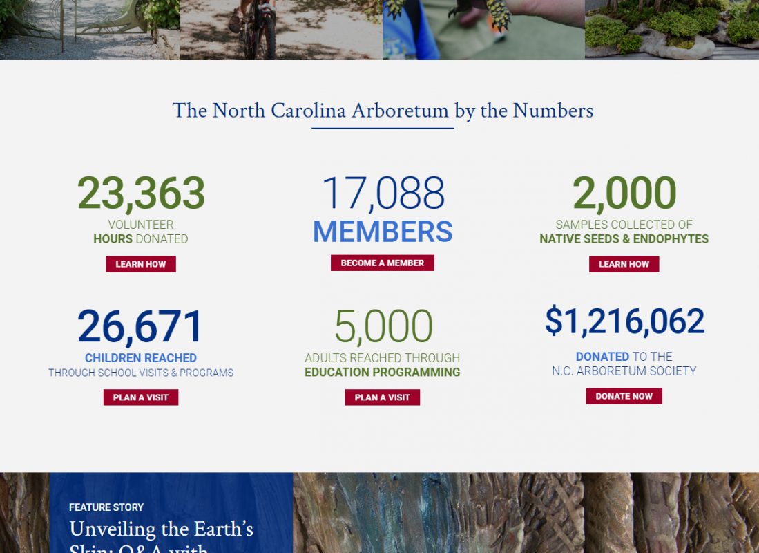
Minimally, we would suggest re-creating the stats from an annual report and featuring them in the donation section. But ideally, these stats should be featured on the homepage. Consider how the North Carolina Arboretum displays impact stats on their homepage.
Another good example is the Tate’s donation page that conveying their impact using video to make the connection between giving and impact.
The Nelson-Atkins Join/Give page also does a good job of displaying impact stats. And they follow up these stats with a simple call to action of buying a T-Shirt to support the museum. That’s an excellent way to convert a visitor into a donor.
While not a museum, the Research Technology Institute makes a substantial investment in giving visual expression of their impacts (here and here). Museums may not be able to invest as much as RTI for an impact page, but certainly somewhere between featuring the basic numbers, to a robust expression like RTI’s should find some presence on museum websites.
Visual Display of Non-Measurable Impacts
But like we noted, many forms of impact, some of the most valuable ones, get buried in those concrete stats, or missed entirely since they are, by nature, invisible and personal. So how can a museum visually convey these internally-oriented impacts?
Since impact is the point of contact between your collections, programs, and resources and people, one way to display impact is through people-oriented photography. Our client, the Nasher, does an excellent job of this. If you scan their homepage you’ll usually find a conscientious blend of art and exhibition focused images with images of people in the museum context—enjoying their galleries and engaging in events.
Photography of people in your galleries doesn’t reveal their inner thoughts, but a talented photographer can wield their camera in ways that evoke engagement. People-oriented photography can be used to evoke contemplation, excitement, discovery, community, and fun. Integrating such imagery into your museum’s website will convey a sense of impact and engagement in ways that numbers never will.
Another good example of impact photography is the Walters. They maintain a good blend of object imagery and human-focused images. In particular, their use of people-oriented photography in connection to their support CTAs is a great touch.
One other very subtle touch that adds to photography’s ability to convey impact is the use of a subtle JavaScript zoom effect. Rolling over some of these images triggers a slow zoom subtle draws you into the frame, connecting you with that moment.
The Rhythm of Related Content
One of the biggest design and development challenges in building any museum website is mapping out the multi-faceted relationships between all its various content types. But visual interface elements that manifest the oblique connections between artworks, artists, events, posts, audio resources, research, and other related content are not only helpful user-experience tools, they reveal the depth and richness of museum content.
When museum content is sufficiently interrelated it creates a visual rhythm of connectedness, deepening the sense of engagement and value of the collection. Consider the Buffalo Soldiers story on the National Museum of African American History and Culture. Not only has the NMAAHC produced a compelling story using images, video, and text, but they also wisely concluded the piece with discussion questions and a link to additional educational resources. Education is a primary focus of impact, and featuring and relating educational resources helps to visually express the important educational impacts that the museum is making.
Showing Community Impact Through Social Media
Tapping into active social media communities is another way to visually display impact. Unless your feeds are already full of the sort of people-oriented photography I mentioned above, merely displaying the museum’s own Facebook, Twitter, and Instagram posts doesn’t necessarily convey much impact. But when you use social media aggregation tools like taggbox.com to pull in user-contributed posts and photos of special exhibitions and events, you can demonstrate your museum’s impact with authentic content that is always fresh and relevant. Take a look at the “Newfields Moments” section of Newfields’ homepage, for example. You can find photographs of people enjoying the museum grounds and events, and being drawn into the objects on the wall. More importantly, these photos were taken by real people having real experiences. You can’t contrive something like that. And by showing your visitors that you’re using their photos on your homepage, you can certainly encourage more of it. Integrating community this way makes engagement impact readily apparent.
Beyond this sort of aggregation, some of the most effective museum social media campaigns are built on this same two-way street. When given the right platform, visitors and fans will engage with their favorite institutions and become advocates to their social networks. The Field Museum gave their prize specimen, SUE the T.Rex, her own Twitter account. With this account, the Field goes beyond the broadcast model of tweeting to have real interactions with its most ardent and loyal visitors. SUE regularly responds to and retweets posts from her followers, making for a Twitter feed that looks more like a fanzine than a bulletin board.
Another recent social media campaign that organically evoked a sense of awe from social media communities was January’s #museumsnowballfight. Started by social media managers at the Museum of the City of New York and the New-York Historical Society, this simple campaign made a game out of sharing museums’ snow-related objects with the world and ultimately reached people who might not have otherwise considered supporting their local museums.
The Impact of Impact
If museums begin to give more visual attention to conveying impact on their websites, then their communities and patrons will be increasingly aware of these impacts and the real value of your collection, programs, and resources—and that will lead to an even greater willingness to contribute and volunteer. Investing in the visual display of impact can have a real impact on the overall effectiveness of your site.