A visitor to a content-rich museum website, like a customer at a bookstore, can easily spend long periods of time simply browsing around. For the bookstore owner, the customer’s visit ideally leads to a simple conclusion: purchasing a book. For the museum, the website user’s visit should also have an ideal objective. Typically, this objective is one (or more) of the following: purchasing tickets, becoming a member, making a donation, or planning a visit.
An effective design tool that helps prompt visitors toward an objective is a clear Call to Action (CTA), often in the form of a strategically-placed button. Many popular websites feature such CTAs. Consider the homepages of Netflix and Chipotle:

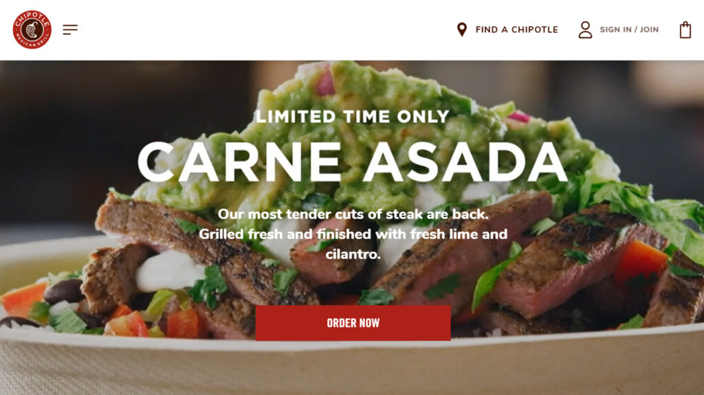
Where is your eye drawn on these pages? It’s hard to miss the bright red buttons that read “Sign In” and “Get Started” (Netflix) and “Order Now” (Chipotle), which prominently invite users to click on them.
CTAs are known to increase conversion rates. Statistics vary about how much of a difference they make—and the difference surely varies from industry to industry—but that they would be effective is simply common sense. Website visitors often come a site and immediately feel bombarded with a massive amount of information. Nudging them to a particular page helps clarify where they should go.
Museum CTAs – Common (and Best) Practices
We visited 40 museum websites (for a list, scroll to the bottom of this article) to survey common practices with CTAs.
(Note: In this article we are focusing on CTAs that are visible “above the fold” on laptops and desktops—that is, ones that show up on the homepage before a user begins scrolling. We will look at other types of CTAs in another article.)
Here’s what we found:
- 78% of museum websites feature a Call to Action
- 58% of museum websites feature a Call to Action in the top right corner
- 50% of museum websites feature a Call to Action further down in the middle of the page (usually in the hero image)
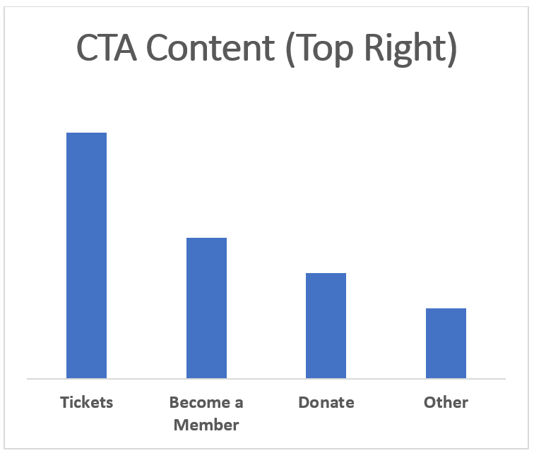
The three most common CTAs in the top right corner ask visitors to purchase tickets, place membership, or make a donation:
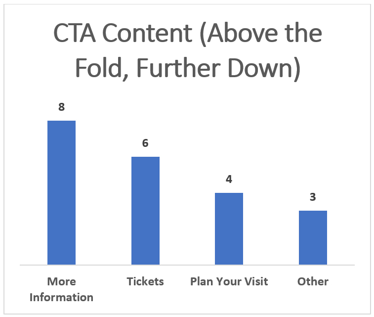
CTAs further down in the middle of the page (but still above the fold) focus on learning more about the particular event featured on the top of the homepage, purchasing tickets, or general visit planning:
The best CTA may differ from museum to museum, and could even change depending on the time of year. A museum with free admission, for instance, might focus on membership or donations rather than ticket sales. And in November or December, a CTA to purchase gift memberships for friends or family members could prove effective.
However the CTA is used, the key is to be intentional about why one option is being chosen over another.
A Word on Hesitation About CTAs
Some museums may wonder whether a direct Call to Action is fitting for their website. After all, aren’t museums fundamentally educational institutions, and isn’t a CTA about trying to sell something? Will website visitors be put off if they feel like they are being pushed by the museum to spend money? Perhaps they should simply be allowed to browse around the site without being directed in one direction or another. Maybe a Call to Action is more appropriate for a commercial site.
It is certainly possible to create CTAs in a way that irritates visitors. A flashy popup window that appears every time a visitor loads a new page is not the way to go. Asking for donations in a way that reeks of desperation may also be counterproductive.
For this reason, it is important to think of CTAs in the right way—as something helpful to both the museum and the website visitor. A CTA can be thought of as a sign pointing clearly toward a particular part of the site where a visitor can do something (buy at ticket, purchase a membership) that he or she already has an inclination to do. When Chipotle makes “ORDER NOW” the center of attention on its homepage, it is making the user experience simpler for the many visitors who have come to the site desiring to place an order. Similarly, a museum that makes links to ticket sales, memberships, or donations stand out prominently is helping users to find what they are looking for—or, in some cases, to recognize or remember a request that they are happy to fulfill.
There is an art to a well-placed and effective CTA which is fundamentally a matter of design. Let’s turn now to some good examples of CTAs on museum websites.
Best Practices & Examples
Stylistically, effective CTAs should be characterized by:
- Strategic placement
- Clear and concise language
- Visual prominence
- Strategic Placement
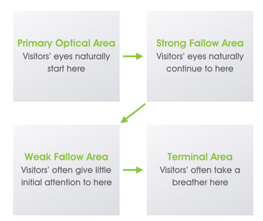
By tracking the eye movements of website visitors, researchers have found that our eyes often move in a z-shaped pattern across a page. We start in the top left, move to the top right, then go down to the bottom left, and end at the bottom right.
This phenomenon is related to what has been called the Gutenberg Pattern or Gutenberg Diagram:
Source: https://downthelinedesign.co.uk/effective-website-design-gutenberg-diagram/
The Netflix example given above uses this z-shaped pattern to draw the user’s attention to the two red CTA buttons:

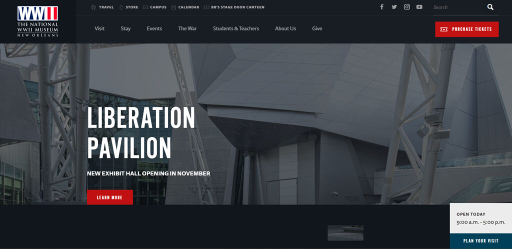
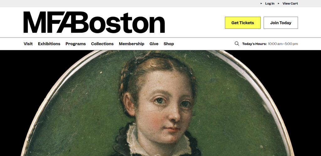
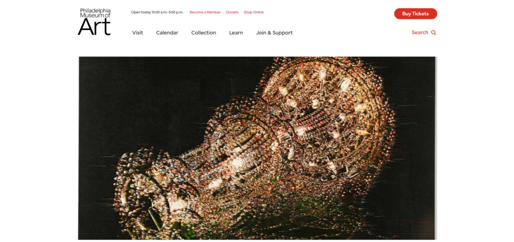
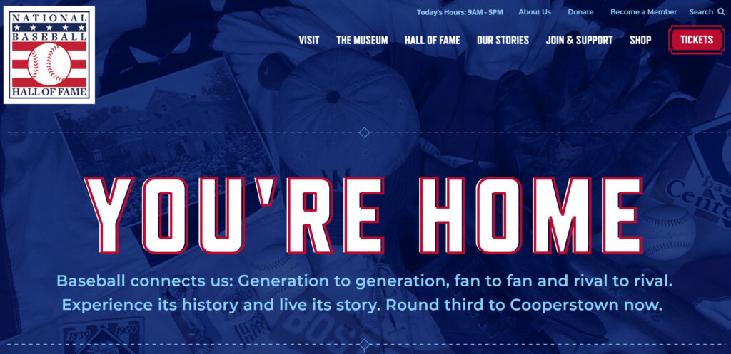
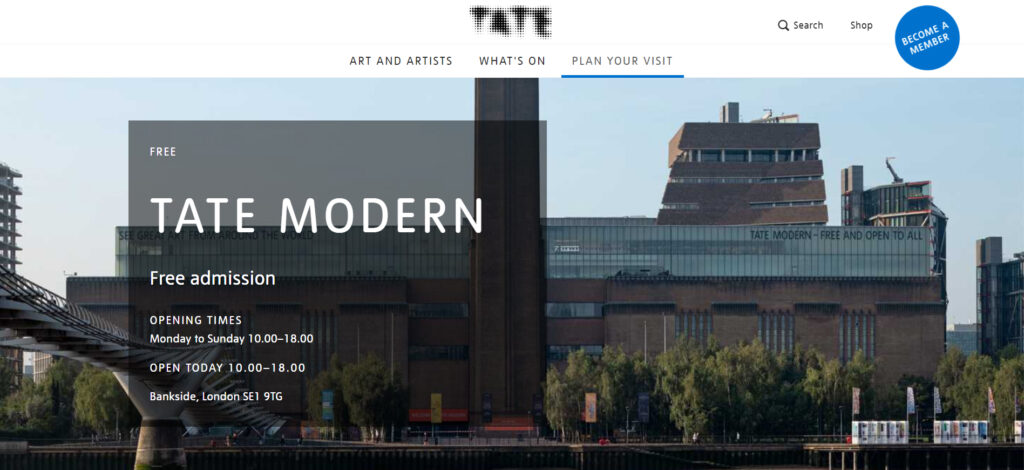
Many museum websites use the same pattern for their own homepages. Consider these examples and note the positioning of the CTA buttons, with variations on the z-pattern:

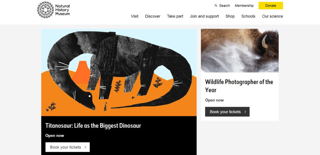
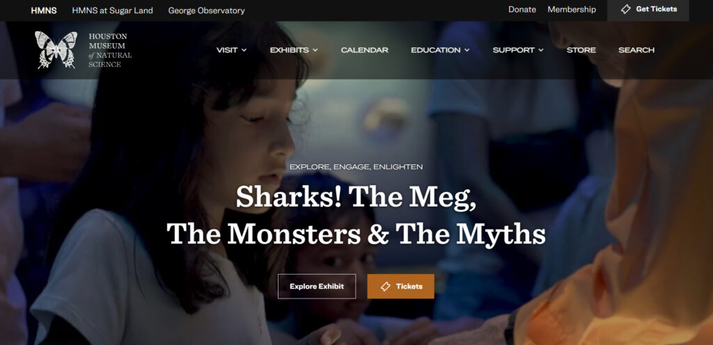
Not every website must follow this same pattern, though it can serve as a helpful starting point. The key is that CTA positioning be strategic.
- Clear and Concise Language
Generally, a simple word or short phrase is sufficient for a Call to Action. “Tickets” might be phrased as “Get Tickets” or “Buy Tickets.” For a link to an exhibition page, “Learn More” is sufficient; an entire sentence like “Find out more about the exhibition,” as one site does, is not typically necessary.
Concise language is especially important for CTAs in the top right corner of a page, where there is not likely much space to work with in the first place.
- Visual Prominence
Since a CTA needs to be quickly noticed, it should be visually prominent. CTAs that receive more clicks have the following characteristics:
- Button – A button, not simply a text link.

- Color – A color that stands out from the rest of the page. Some studies suggest that the best color is red, but this may not always be the case. The best practice is whatever color contrasts well with the rest of the page.
- White Space – Removing clutter and increasing the space around a button has been shown to increase clicks.
- Fewer, Not More – Too many CTAs can reduce conversion rates.
There are other ways to draw attention to a CTA. A pop-up window or header, as featured on the 9/11 Memorial & Museum and American Museum of Natural History sites, can temporarily feature a push to encourage visitors to register, donate, join, etc.
Finally, a more creative design, as shown below, can draw an additional degree of attention to a CTA. It is impossible to miss the large “Become a Member” button, which pops out of the page.
Conclusion: Improving Your Call to Action
Much more has been said about the best practices for Call to Action buttons, and this article has not even touched on the ways they can be used on other parts of a site.
As you reassess your site’s need for a strategic CTA, consider these questions:
- What are our conversion objectives? Where do we want to direct users when they come to our site? What do we want them to do?
- Do we have a system that can measure conversion rates? If we add a CTA or modify our current one, how will we evaluate its effectiveness?
- Likewise, how are users currently browsing the site? Are they visiting the pages we want them to visit?
- If we are using CTA buttons, do they have these important characteristics: (1) Strategic placement, (2) Clear and concise language, and (3) Visual prominence?
Not every website has to implement a Call to Action the exact same way, placing CTA buttons in identical positions. But they can be an important tool in designing a well-planned site, and are certainly a helpful part of the discussion.
Museum websites visited in this study:
- 9/11 Memorial & Museum
- American Museum of Natural History
- Art Institute Chicago
- Asian Art Museum
- Blanton Museum of Art
- British Museum
- Brooklyn Museum
- California Science Center
- Cleveland Museum of Art
- Detroit Institute of Arts
- Field Museum
- Getty
- Guggenheim
- Henry Ford Museum of American Innovation
- Houston Museum of Natural Science
- Kennedy Space Center
- LACMA
- Louvre
- MFA Boston
- Minneapolis Institute of Art
- MoMA
- Museum of Fine Arts, Houston
- Museum of Science
- National Baseball Hall of Fame
- National Gallery of Art
- National Museum of American History
- National Museum of Natural History
- National Museum of the US Air Force
- Natural History Museum
- Philadelphia Museum of Art
- Tampa Museum of Art
- Tate Modern
- The Children’s Museum
- The Met
- The National Gallery (UK)
- The National WWII Museum
- US Holocaust Memorial Museum
- USS Midway Museum
- Victoria and Albert Museum
- Whitney