Effective websites strategically nudge visitors toward predetermined actions. On museum websites, this typically includes purchasing tickets, making a donation, signing up for a newsletter, or purchasing a membership or an item from the online store. As we discussed recently, Call to Action (CTA) buttons are an effective way to increase conversion rates, especially when they (1) are placed strategically, (2) use clear and concise language, and (3) are visually prominent.
In this article, we will go beyond “above the fold” CTA buttons and explore effective practices for CTA placements on other parts of a page.
Calls to Action vs. Typical Links
Before we begin, we should note that any link can be styled as a button, but that does not make every button a Call to Action. For our purposes in this article, a Call to Action is a link that is:
- Goal-Oriented – A Call to Action prompts a visitor not merely to visit another part of the site, but to do something: make a purchase, fill out a form, download a file or an app, etc.
- Conversion-Driven – Ideally, a Call to Action can be tracked in terms of measurable conversions.
Buttons not in this category include ones that simply say things like “Explore” or “Learn More.” While these links may be part of an important strategy to direct visitors to a particular page, they are not calling the visitor to take a particular action. They are simply visually-appealing ways of navigating a site.
In short, a CTA button is like a salesperson—attempting to influence behavior—while a link styled as a button is like a signpost—identifying how to proceed to a destination of interest.
1. Sign Up for Our Newsletter
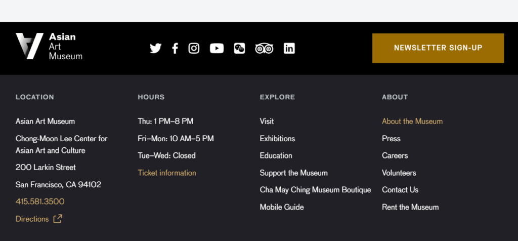
The most common place to find a call to sign up for a museum’s newsletter is in a website’s footer. This might take two forms: a button or an embedded form.
A button is a clean and simple way to direct users to a sign-up page or trigger a pop-up window where they can fill in their information. Around half of surveyed museum websites use this method, of which the Asian Art Museum’s footer is a typical example:
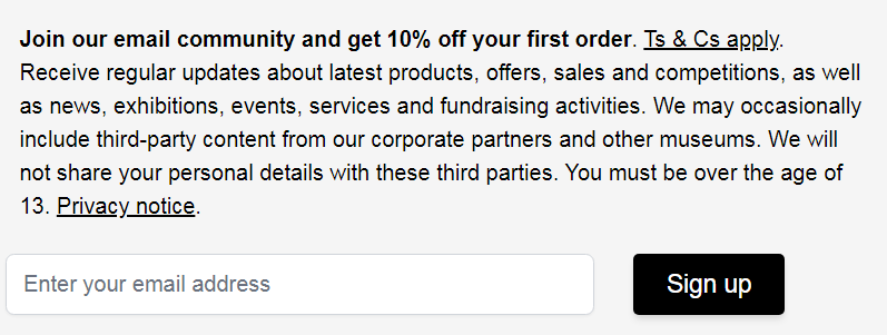
Other museum websites (around 50% of the three dozen I browsed) save users a step by embedding a form directly into the footer, as we see in the footers of The Met and the Detroit Institute of Arts:

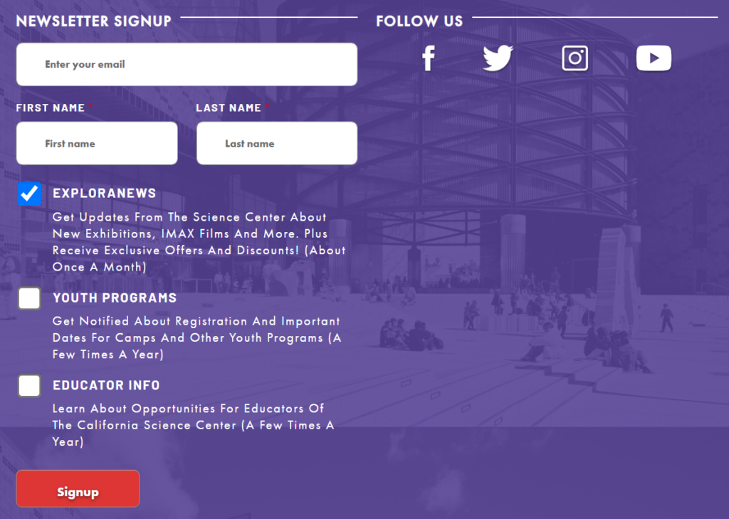
A form that includes more than a simple email address field may be undesirable if it takes up too much space, but some museums have figured out clever ways around this limitation. The California Science Center, for instance, features this simple form in their footer…

…which expands after “Enter your email” is clicked:
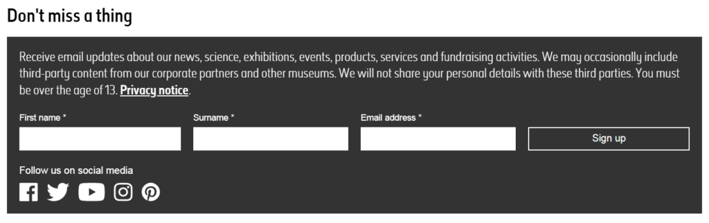
Besides the footer, a site may have other strategic areas to place a newsletter sign-up form. The Natural History Museum’s News page features a sign-up form halfway down the page in the middle of its latest articles:
2. Purchase Tickets or Membership
A call to purchase tickets or a museum membership are by far the most common CTA buttons in website headers. They can also be found on other parts of pages, typically next to descriptions of current or upcoming exhibitions.
(For museums that charge for general admission, multiple calls to purchase tickets are likely less necessary than for museums that offer free admission but charge for particular exhibitions. In the former case, purchasing a ticket is simply a necessary requirement for visiting the museum; in the latter case, it is an optional add-on.)
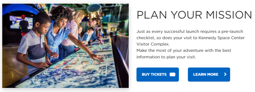
A CTA ticket button at both the top and bottom of a page can be an effective method of keeping it in front of visitors. The Kennedy Space Center’s “Explore Attractions” page features a CTA button first in the header, then again at the bottom of the page once a visitor has finished scrolling:
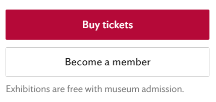
The North Carolina Museum of Art—which offers free general admission but requires tickets for special exhibitions—has no ticket CTA in its header but does feature a prominent button on pages for paid exhibitions:

A ticket button and a membership button often go hand-in-hand, especially when a membership perk is free or discounted tickets. Information on membership next to ticket information is seen in the example above and also on the Art Institute Chicago’s exhibition page:
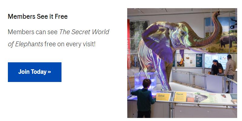
As the American Museum of Natural History informs visitors, “Members See It Free”:
A mistake to avoid is placing membership information too far down a ticketing page to be easily noticed. Giving potential ticket-purchases an easy choice between clicking on buying a ticket or a membership increases the chances that they will choose the latter.
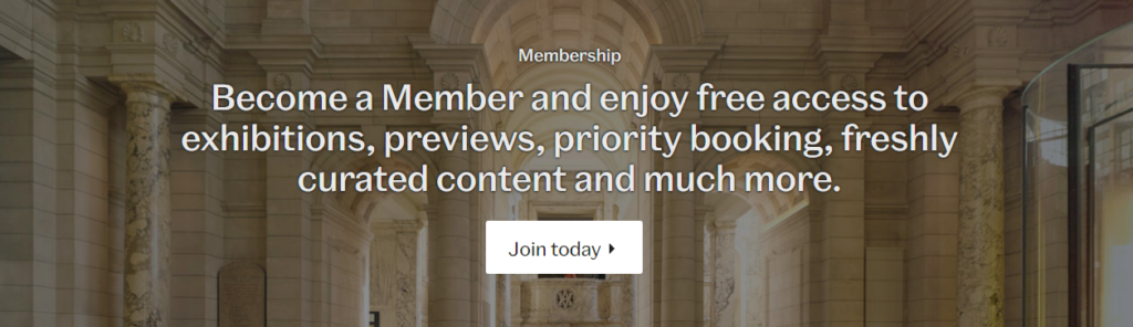
Apart from being combined with ticket purchase CTAs, CTA buttons encouraging membership are often seen as their own entities on homepages, often with accompanying text and image:
The Victoria and Albert Museum (Homepage):
Detroit Institute of Arts (Homepage):

Cleveland Museum of Art (“Plan Your Visit” page):

3. Make a Donation
A call to make a donation is typically made in a similar way on the homepage. A donation button on its own would be less effective than the kind of brief appeal combined with an image and a CTA button seen from the following museums:
National Museum of American History (homepage):

Cleveland Museum of Art (homepage):

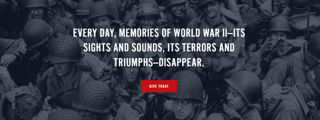
The National WWII Museum (homepage):
Shop
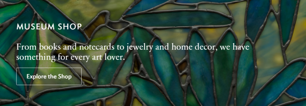
Once again, we see the same format for buttons directing visitors to the museum’s online storefront:
Art Institute of Chicago (homepage):
Houston Museum of Natural Science (homepage):
Victoria and Albert Museum (homepage):

Other CTAs
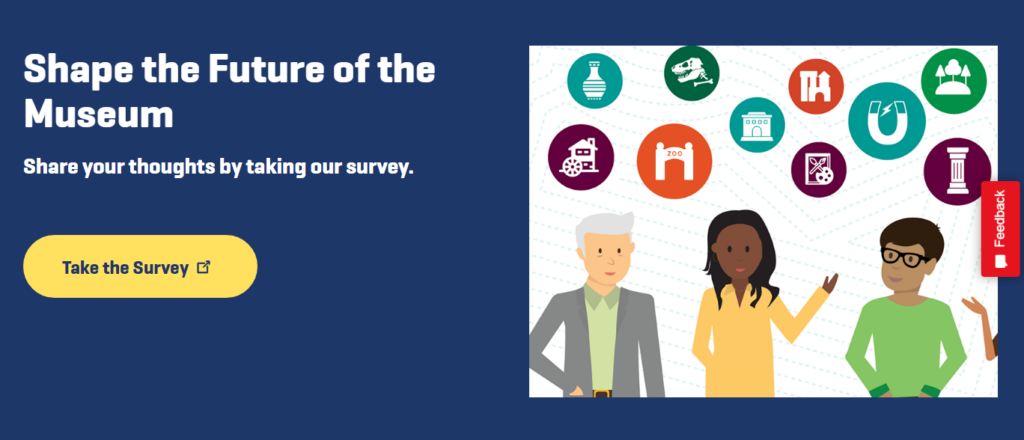
More helpful Calls to Action might include “Plan a Field Trip,” “Host an Event,” “Take a Survey,” or “Download the App.” Each of these, like the others already described, are actionable items which can be measured and which go beyond merely browsing the website.
Art Institute Chicago (note how the familiar App Store and Google Play buttons are used in place of a standard button):

Automating CTAs with Dynamic Workflows
With a dynamic platform like the one Cuberis offers, CTAs that are date-specific can be automated to disappear at a particular date and time. This can save effort and help ensure that a “Get Tickets” button for a temporary exhibition or a holiday-themed “Give the Gift of Membership” button will only display during the right period of time.
Museums can also create dynamic workflows for changing the content of a CTA after it has been acted on. For example, once a visitor subscribes to a mailing list, the same CTA location can be updated to show a membership CTA. If the visitor becomes a member, the CTA can be swapped out for a donation button.
For a demonstration of this feature try this demo signup. It will redirect you to a thank you page where it sets a cookie. There will be a return button that links back here where you will see the membership CTA instead. (Note: this feature relies on cookies so it may not function correctly if your computer disallows cookies.)
Demo Newsletter Signup
Become a Member Today!
Done well, an effective CTA supports the museum’s objectives and enhances a visitor’s experience on the website and, ultimately, at the museum.