Browsing a website has a lot in common with setting foot in a museum, especially when it comes to navigation. While one museum visitor may know precisely where she wants to go, and another may be content simply to explore, what both visitors have in common is a need for a good map. The first visitor needs to quickly discover how to get to her desired destination, and the second needs to develop a broad idea of what is available. In either case, the map helps them to reach their goal.
A good website, likewise, allows for easy and straightforward navigation for whatever type of user comes to the site. As we have written previously (People Don’t Read on the Web, and Other Fallacies), website visitors may come looking for different levels of information—to “skim,” to “swim,” or to “dive”—and it is essential to provide a navigational system that keeps all three types of users in mind.
What does it look like when a museum does this well? In this article we survey examples of sites with effectively and skillfully designed navigation systems using seven key principles:
- Create a Simple Menu with Drop-Down Options
- Keep the Menu Visible as the User Scrolls
- Consider Using a Mega Menu
- Implement the Rule of Sevens
- Break a Long Page into Sections
- Use Tags, Categories, and Related Content
- Use Effective Calls to Action
(While this article does not focus on mobile versions of sites, the same principles can be adapted and applied for those as well.)
1. Create a Simple Menu with Drop-Down Options
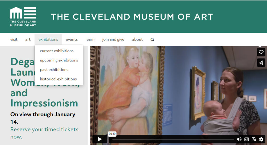
The Cleveland Museum of Art features a simple and clean navigation menu with submenu options that pop up when the user hovers over the link. A magnifying glass icon simplifies the option for performing a search.
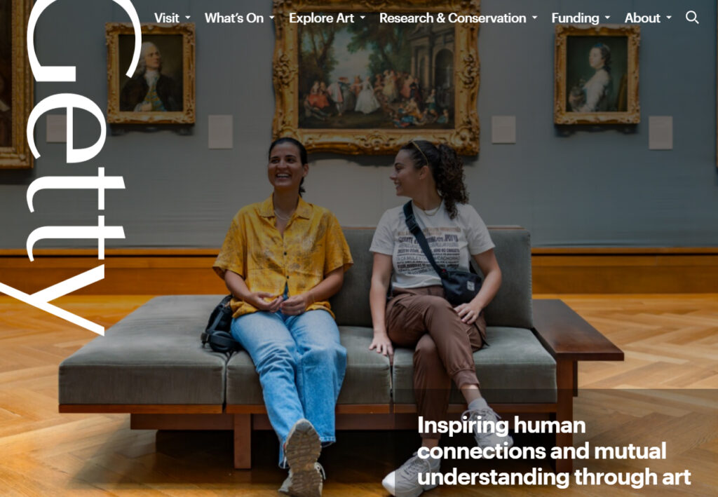
The Getty’s website is similar and also adds small arrows next to each menu item to indicate to the user that more options are available. Some websites feature arrows that pop up when the user hovers. Since users are accustomed to seeing submenus come up, arrows are not strictly necessary, but they can be a helpful indication that more is included in the navigation menu, especially if some links contain dropdowns and others do not.
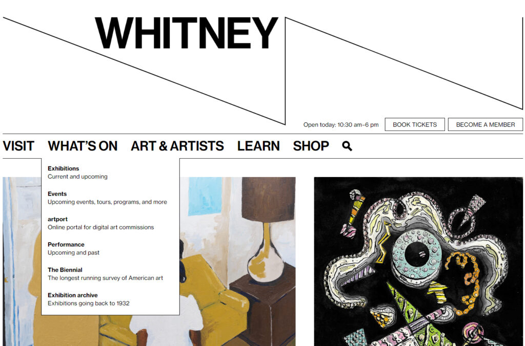
The Whitney Museum of American Art adds a brief description to each submenu link, adding helpful contrast by setting the title in bold and the description in regular type.
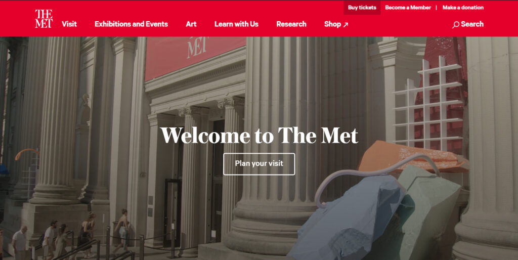
Sometimes a menu link goes to a separate site that pops up in a new tab. The Met adds a subtle feature by making a small diagonal arrow pop up when the user hovers over the word “Shop.”
(Having a link open in a new tab should be used sparingly and intentionally. A website that makes every link open in a new tab is likely to frustrate visitors.)
2. Keep the Menu Visible as the User Scrolls
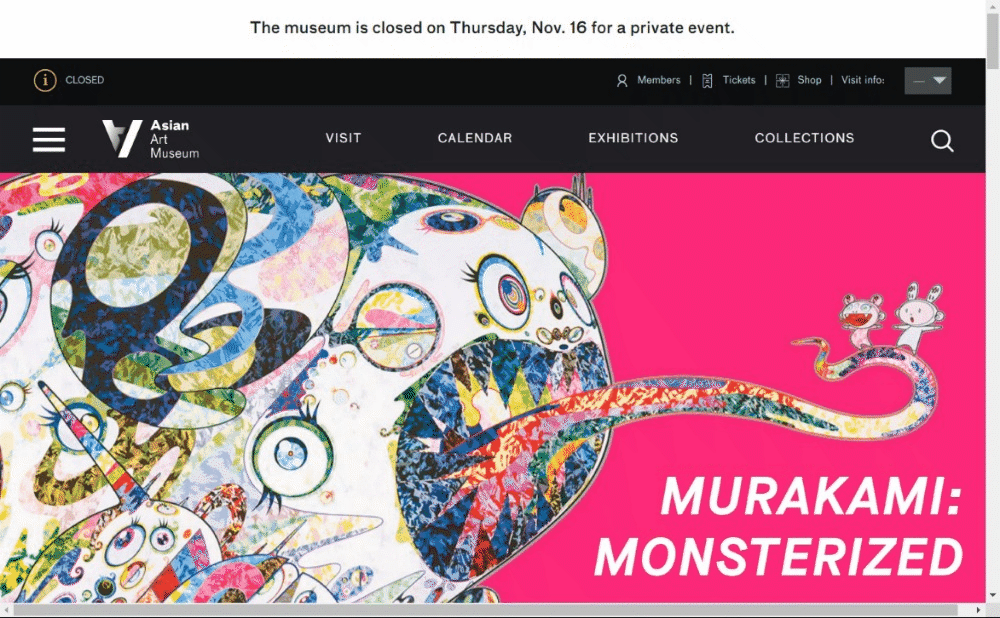
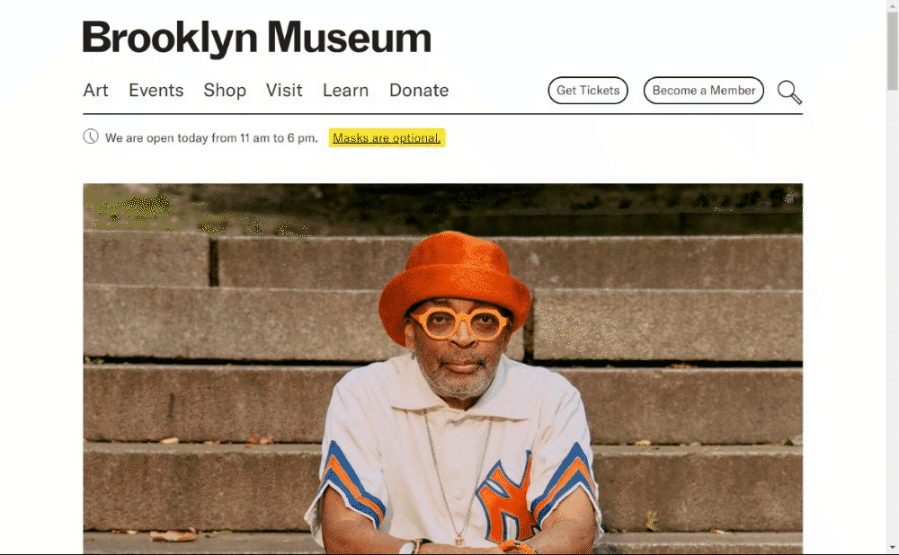
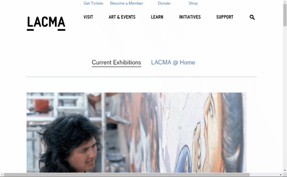
This is more of a preference than a rule, but keeping the menu visible at all times can make a site easier to navigate. This type of “Fixed Header” or “Sticky Header” can be seen in the animated screenshots below, including the Asian Art Museum, the Brooklyn Museum, and the LACMA.
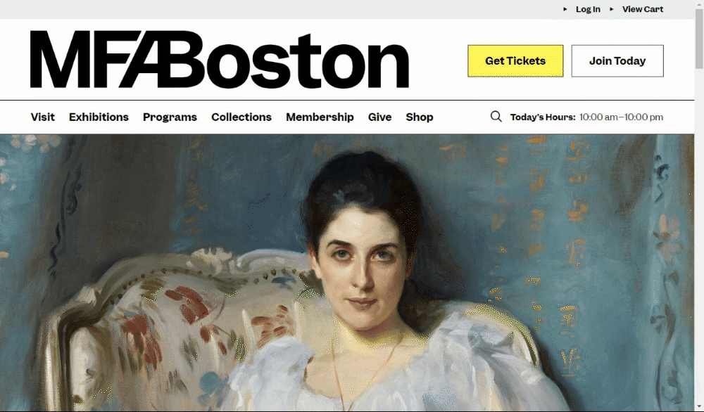
With a fixed header, the site designer can choose which part of the header remains visible, and at what size. For example, the Museum of Fine Arts, Boston retains only a smaller version of their logo and two call to action buttons:
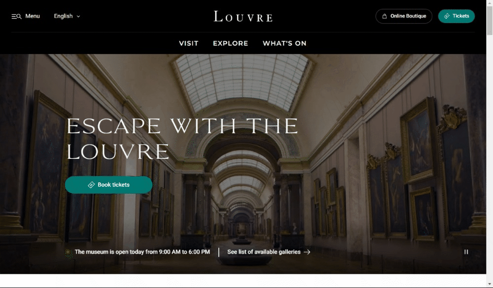
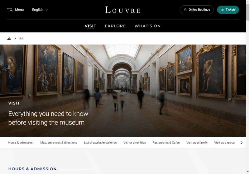
If it is decided that keeping the menu visible requires too much space, it is also possible to have the menu disappear when the user is scrolling down, but then reappear when the user scrolls back up, as happens on the Louvre’s website:
3. Consider Using a Mega Menu
A mega menu allows a submenu to include more content, including images, organized into multiple columns. We have previously written about their advantages in Museums and Mega Menus.
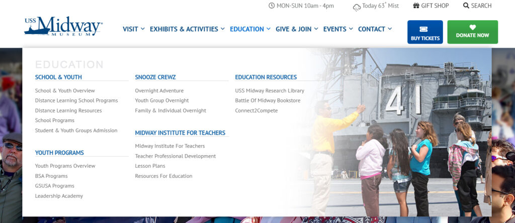
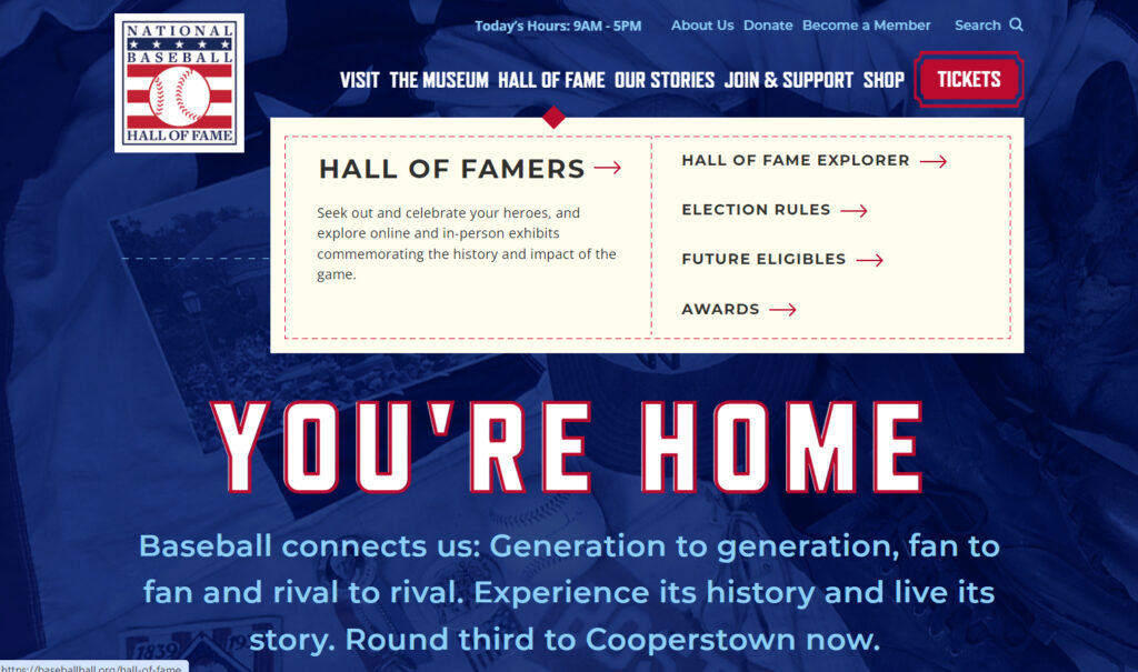
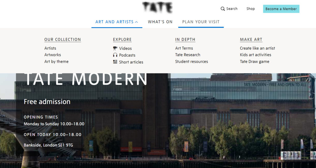
The USS Midway Museum, the National Baseball Hall of Fame, and the Tate are among museums that use mega menus. For each of these sites, the mega menu appears when the user hovers over one of the top menu links:
4. Implement the “Rule of Sevens”
At some point an excessive number of links becomes overwhelming—but how many is too many? The “rule of sevens” states that because seven is the maximum number of items we can retain in our short-term memory, it is a helpful limit when presenting someone with new information. (Think, for instance, of the way that telephone numbers—apart from area codes—are limited to seven digits.)
On a website, seven or fewer menu items is a good rule of thumb. Submenus should also be limited to seven or, if using a mega menu, they can be divided into sections of seven.
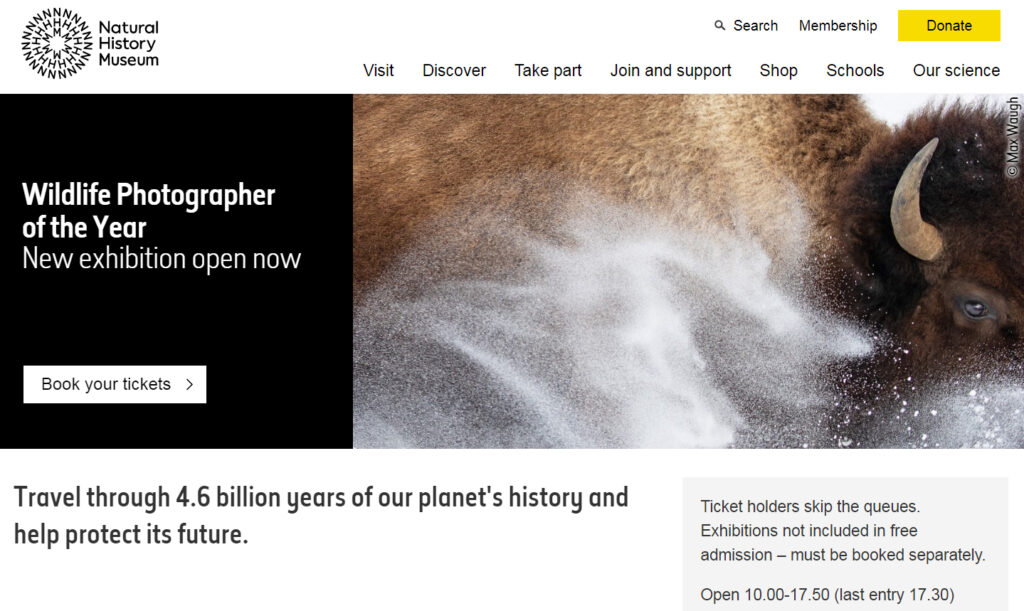
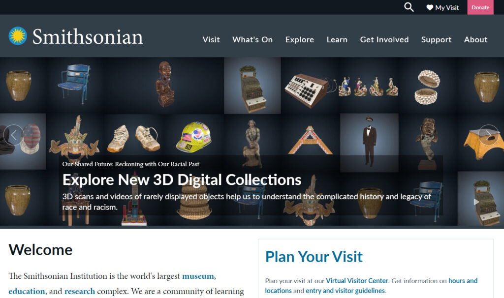
What if more than seven links are needed? These examples from the Natural History Museum and the Smithsonian show how they can be offset in a different row, visually putting them into a different category of options, to keep the menu from becoming too overwhelming to visitors.
5. Break a Long Page into Sections
Dividing a page into small sections using subheadings significantly helps users find what they’re looking for, especially if they’re in skimming mode, and especially if the page is long.
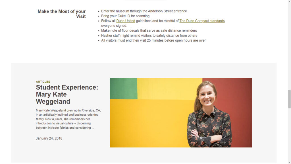
Subheadings typically simply consist of lines of larger text and/or different color above paragraphs of regular-sized text, as we’ve done in this article. But there are other creative methods that enable quick skimming as well. Consider how the Nasher Museum uses columns, with subheadings to the left of each section:
The same website highlights featured articles using a different background color:
Links can be provided to separate sections of the page using anchor links. The Louvre does this in a creative way by combining anchor links with a fixed header so users can easily keep track of their bearings on the page:
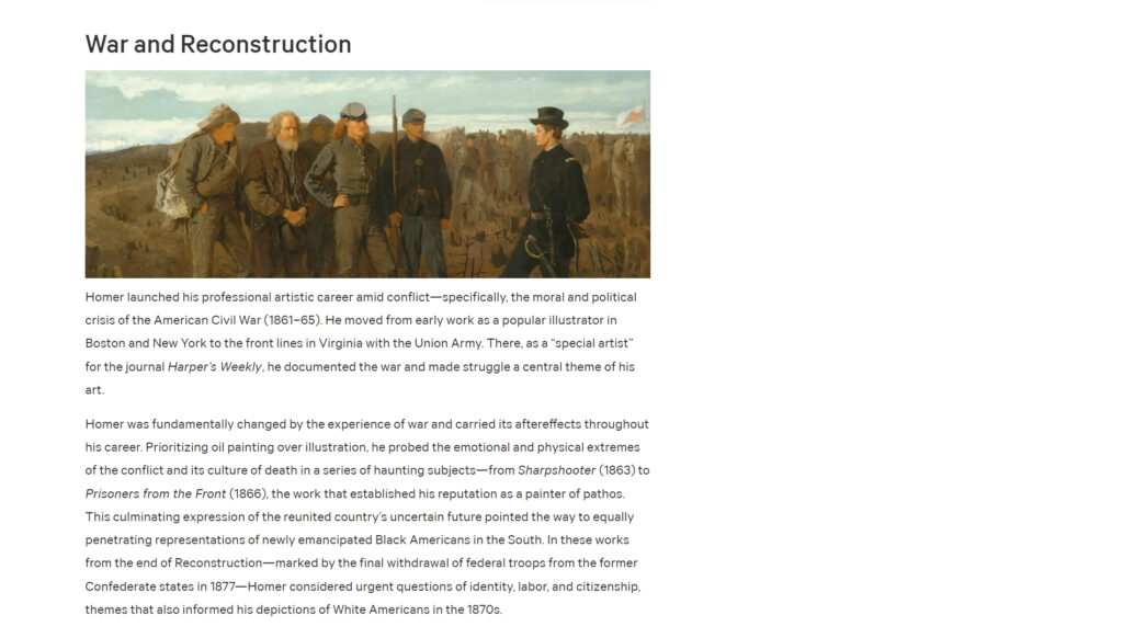
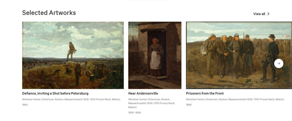
Another effective divide a page that has a lot of images is to make use of horizontal scrolling. On the Met’s Visiting Guide for its Winslow Homer exhibition, sections alternate between paragraphs of text and sections of “Selected Artworks” that are only one row—thus keeping the vertical length of the page shorter—while allowing the user to scroll sideways to view more image.
There are many ways to divide a page, but the key is to make it easily accessible for a user who is quickly scrolling to see what content is available.
6. Use Tags, Categories, and Related Content
So far, we have considered how to organize navigation from a bird’s eye view to help visitors find what they’re looking for or see how the site is broadly organized. We might consider this a top-down approach.
A bottom-up approach is also appropriate, in which we help visitors to take a deeper dive into available content. One such method is the strategic use of tags, categories, and other indicators of related content.
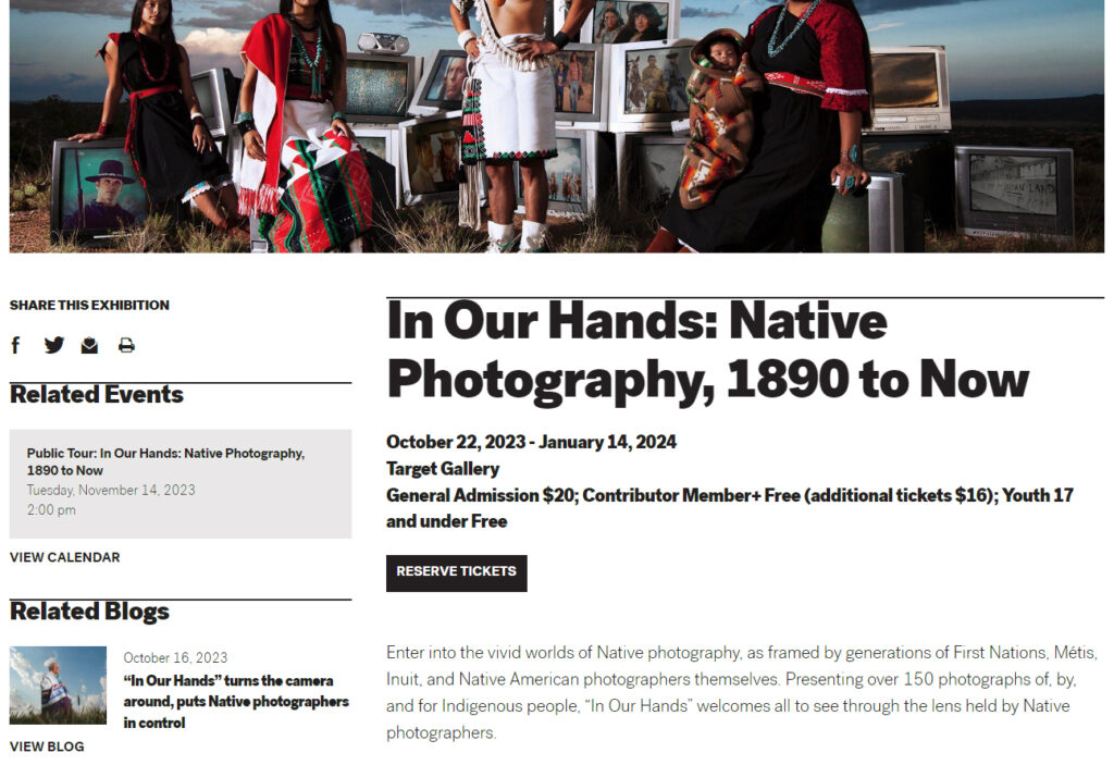
The Minneapolis Museum of Art, for instance, features “Related Events” and “Related Blogs” links on their pages. A visitor interested in their exhibition on Native Photography would see in the sidebar automatically-generated links to the next public tour as well as a blog post related to the exhibition.
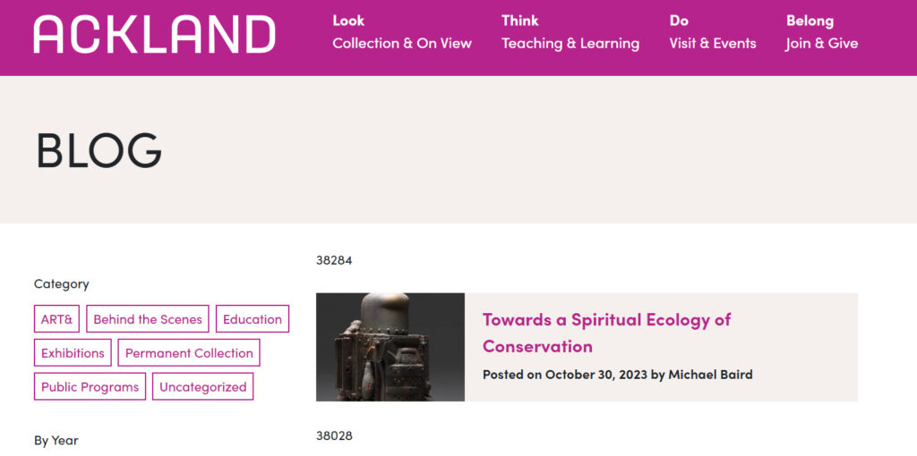
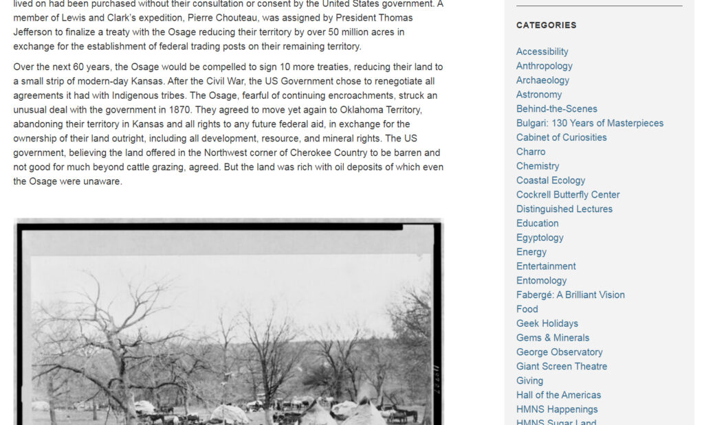
A blog is an ideal place for categorizing pages. The Ackland Art Museum’s blog articles allow visitors to browse by categories both broad (top left) and specific (bottom right).
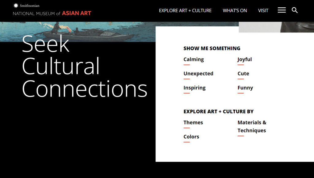
Content can be categorized in a variety of ways, some more expected and some more whimsical. The National Museum of Asian Art tags artwork according to “Themes,” “Colors,” and “Materials & Techniques,” and also by feeling or mood: “Calming,” “Unexpected,” “Inspiring,” “Joyful,” “Cute,” and “Funny.”
7. Use Effective Calls to Action
Finally, an effective call to action (CTA) can help direct visitors to specific parts of a site. Our previous article on CTAs focused on how to put an call to action in the header, but they can also be effective as part of the main body of the site.
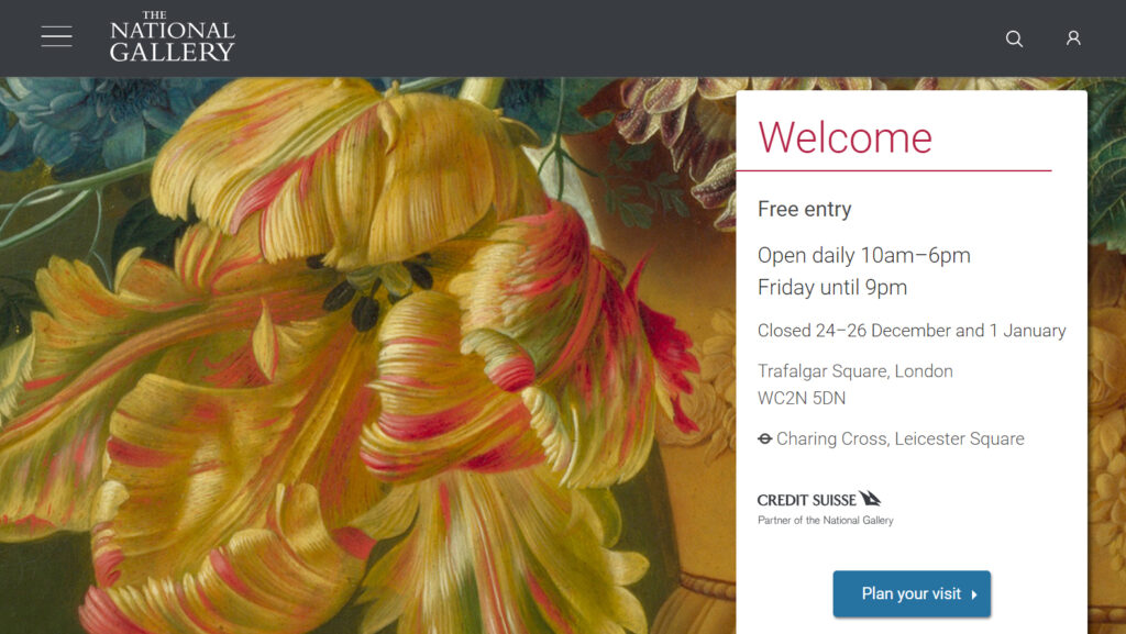
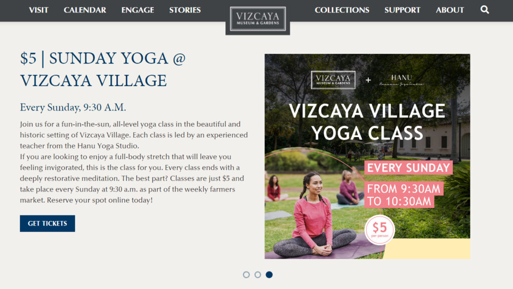
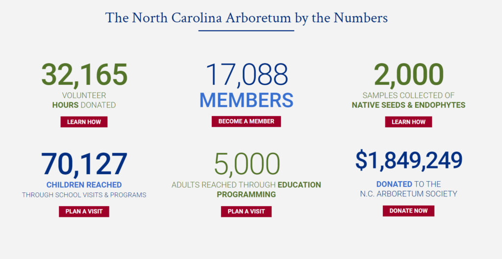
The National Gallery, Vizcaya Museum & Gardens, and NC Arboretum all provide helpful examples of how to use effective CTA buttons.
Conclusion: Improving the Map
Now, take a few moments to browse your museum’s website from the perspective of different visitors:
- Skimmers: Visitors interested in quickly seeing what is available at the site by quickly looking through headers and menu options
- Swimmers: Visitors interested in spending a little more time exploring the content of the site in more detail.
- Divers: Visitors willing to invest significant time reading articles, watching videos, and locating specific information.
Will each type of visitor be able to find his or her way around the site with ease? How does the current navigational structure help or hinder their experience?
Your museum features maps that effectively inform visitors of where there are and where they might go next, and your website should do the same.