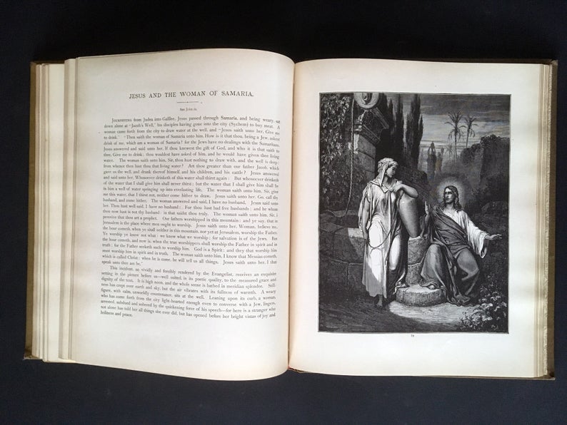
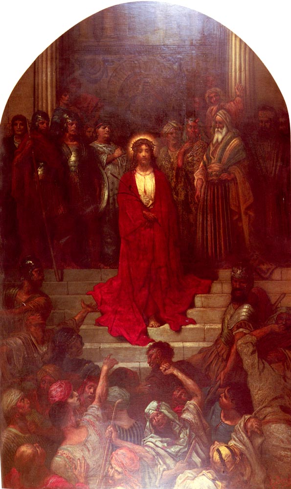
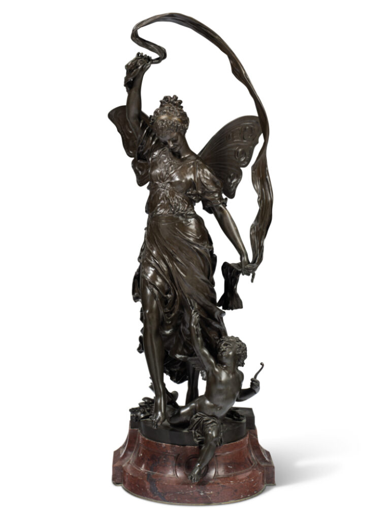
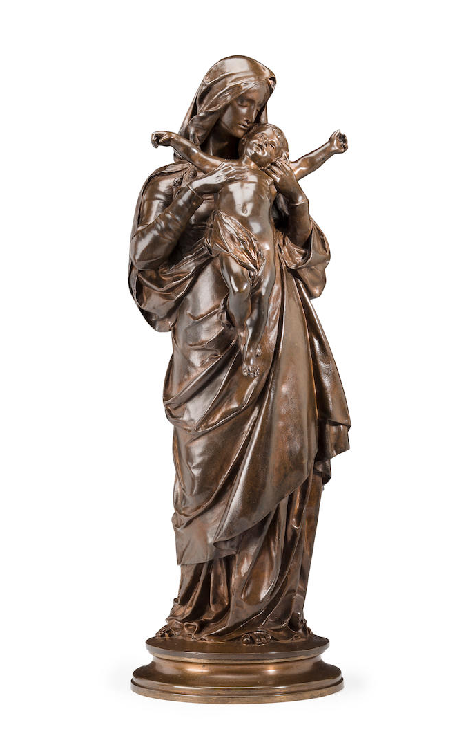
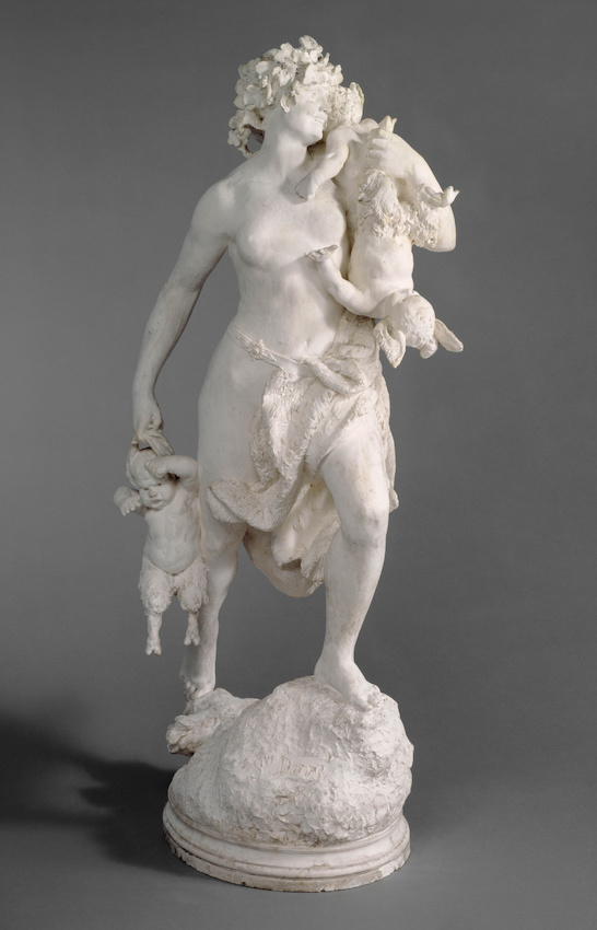
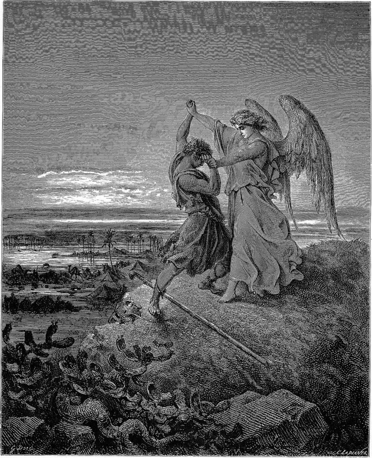
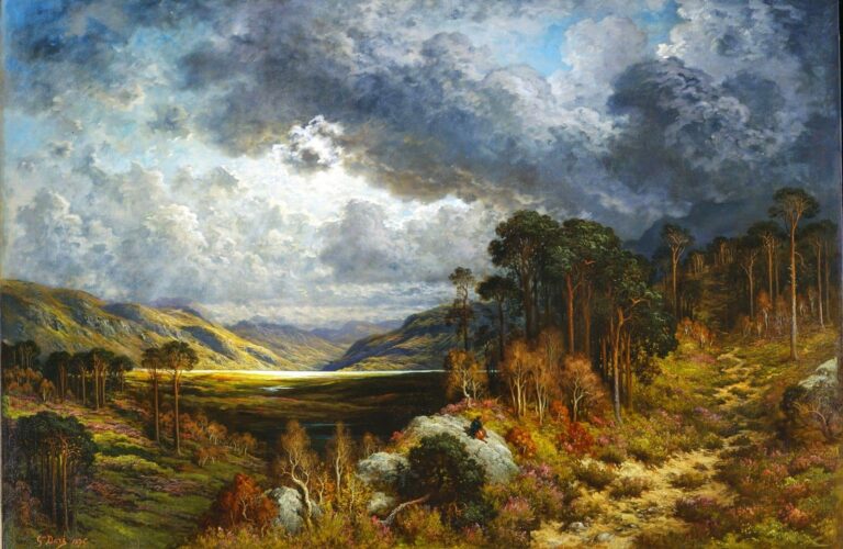
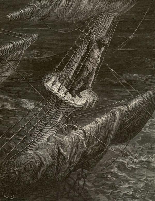
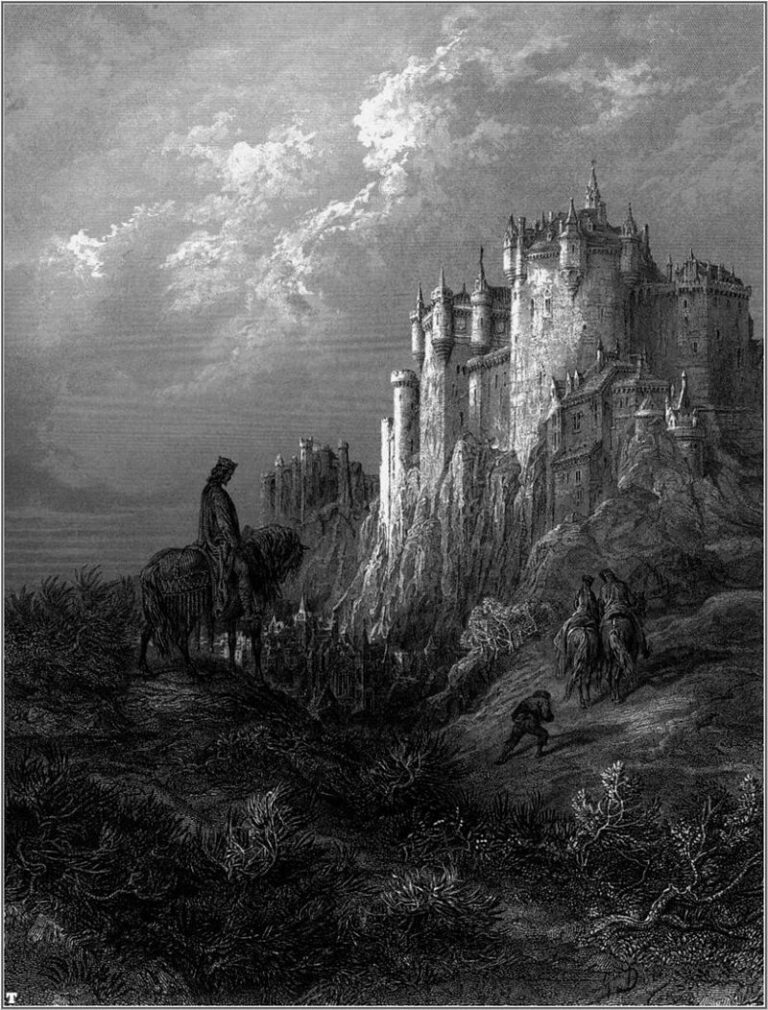
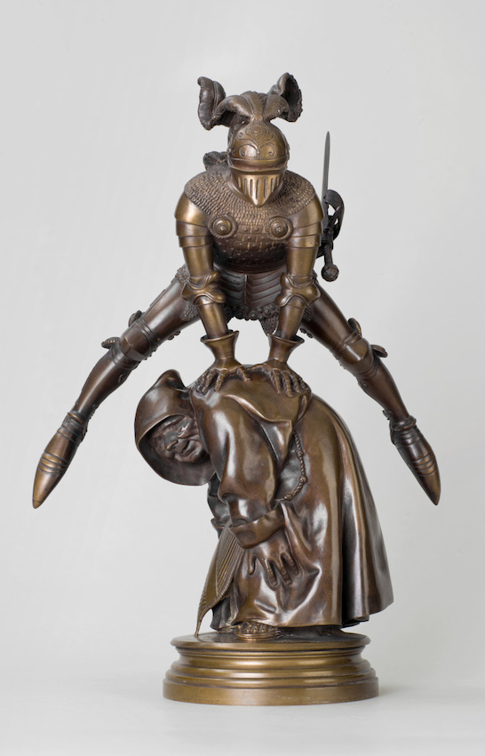
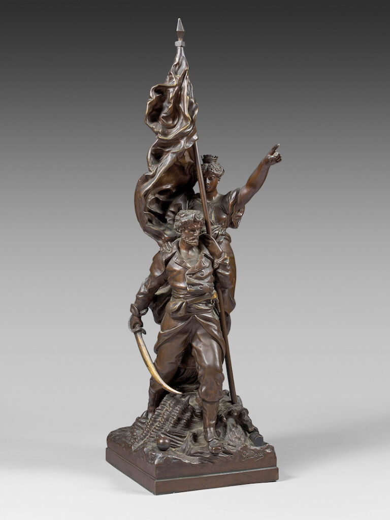
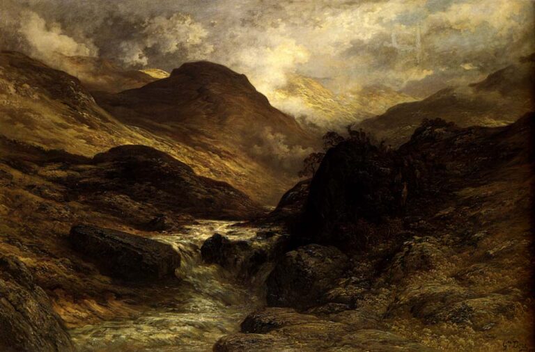
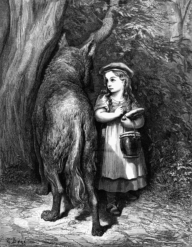
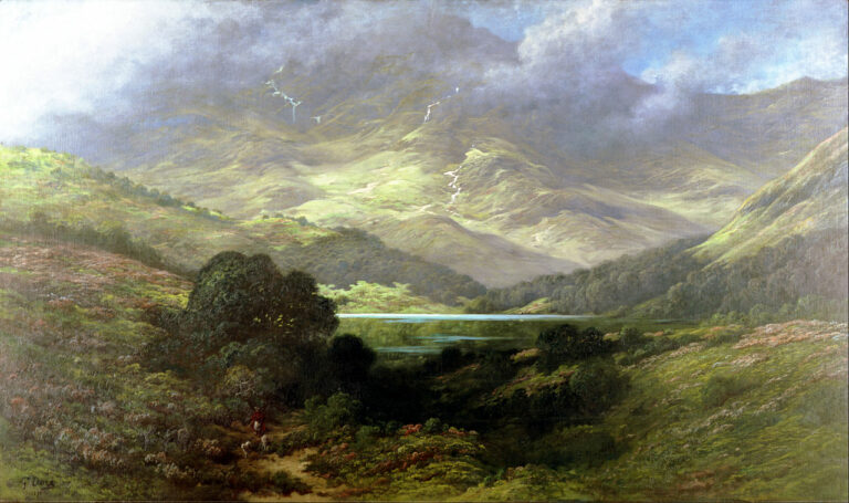
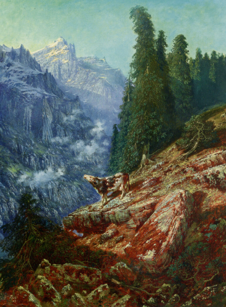
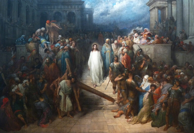
Gustave Doré was a natural born artist. From boyhood he demonstrated talent far beyond his years. While best known for his illustrations of works by Rabelias, Dante, Shakespeare, Milton, Tennyson, and Poe, not to mention his Bible gallery, his artistic exploits also include remarkable landscape and figure paintings, sculptures, and various forms of printmaking. Born in Strasbourg in 1832, by the age of fifteen he was already employed as an artist producing cartoons and comics for Le journal pour rire in Paris. Doré enjoyed a prolific career until his untimely death after a brief illness at the age of 51 in 1883.
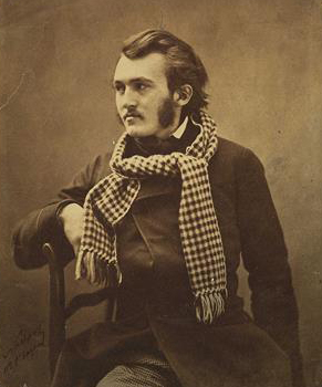
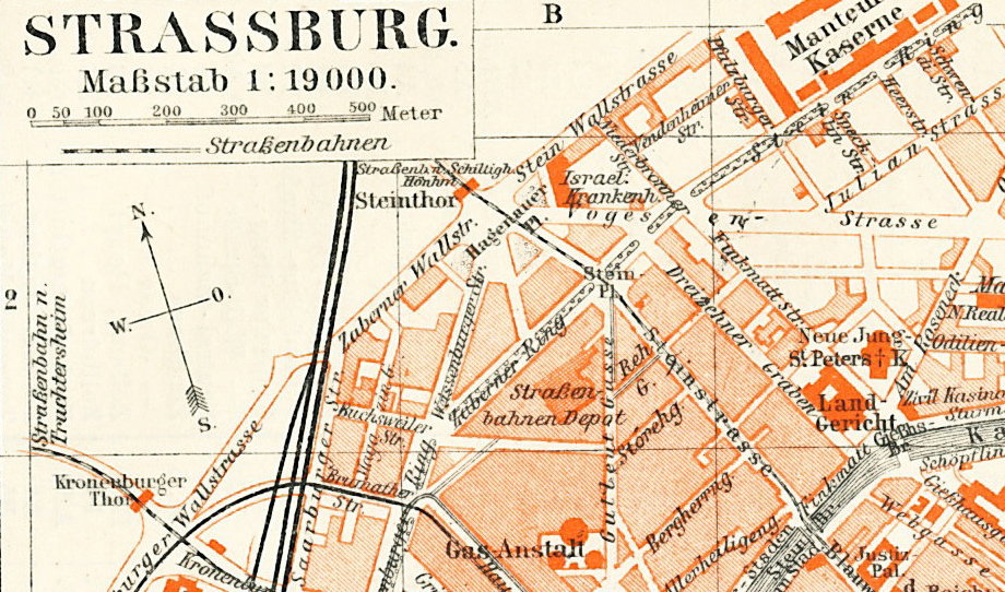
Birth
Born on January 6, 1832, in Strasbouge, France to Pierre Louis Christophe and Marie Alexandrine Pluchart.
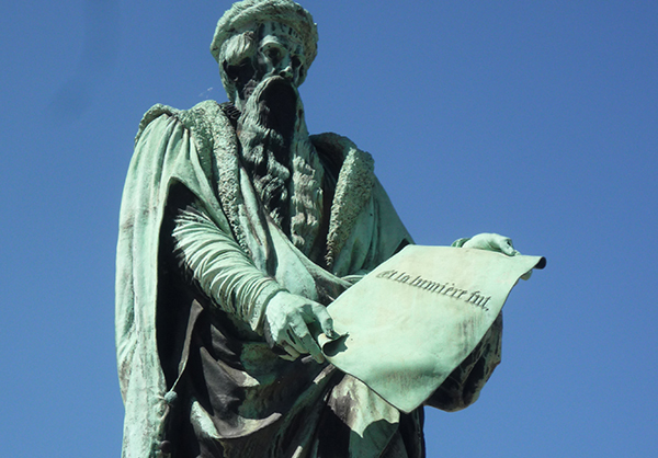
Reenactment of the Gutenburg fête
The Gutenburg fête of 1840 made a big impact on young Gustave. Reenacting this event was perhaps his earliest experience as a budding artist.
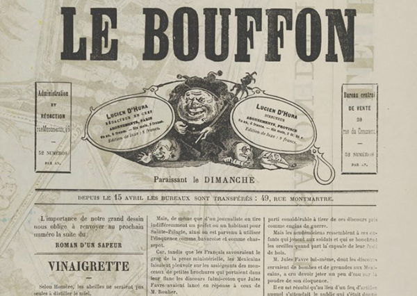
Arrival in Paris, Work for Le Journal
At the young age of 15 Gustave was gainfully employed as a staff illustrator and cartoonist. He quickly became the highest paid artist on staff, and gained significant fame for his prolific work.
Death of Father, Pierre Louis Christophe
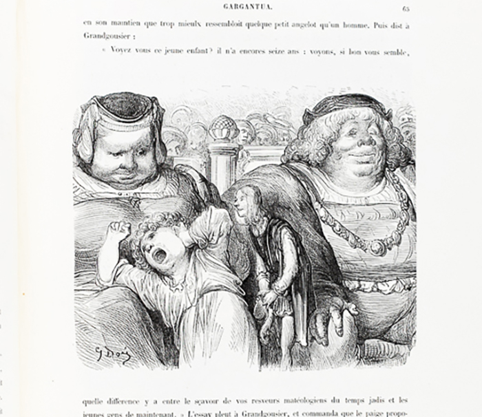
Oeuvres de Rabelais
Among Gustaves’s earliest works were 104 drawings for the Works of Rabelais. This edition brought Doré significant notoriety and accelerated his career.
Awarded the Legion of Honour
 Doré’s work illustrating Dante’s inferno, at his own expense, earned him the French Legion of Honor award.
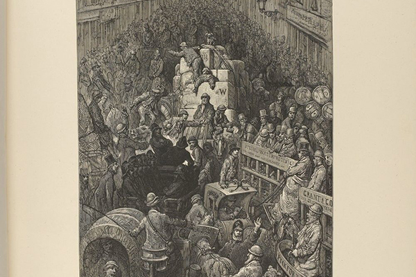
London Pilgrimage
In a four year collaboration with British journalist Blanchard Jerrold, Doré produced over 180 engraving depicting the darker side of Victorian London.
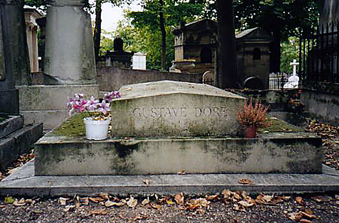
Death
On January 6, 1883 Gustave died at the age of 51 after a brief illness. He is buried in Père Lachaise Cemetery in Paris, France.
Remembered for the Engravings He Sometimes Disdained
Did Doré’s Reputation as a Commercial Artist Undermine His Recognition as a Fine Artist?
At age fifteen Doré entered the world of commercial art, drawing cartoons and illustrations for Le journal pour rire. His vivid imagination and profound skill as a draftsman led to a prolific career as an illustrator. But the artistic tensions between commercial art and fine art were as real in the 19th century as they are today. Though he longed for broader appreciation as a fine artist for his lush romantic landscapes, figure painting, and sculptures, his fame as an illustrator seemed to always undermine his reputation as a fine artist.
The contrast between his profound fame as an illustrator, and the popularity of his books, his reception at the Salon was cool at best. Many of his submissions were outright rejects, and those few that were displayed met with relative disinterest. Some openly criticized his painting and sculptures, imputing to them a sense of literalism which was clearly out of fashion in the age of impressionism.
But could there also have been resentment to his work because of his success as a commercial artist and illustrator? Did his financial success, and popularity undermine his cred as a Bohemian struggling artist, and thus disqualify him in the world of fine art? Such tensions existed then, and are still with us today.
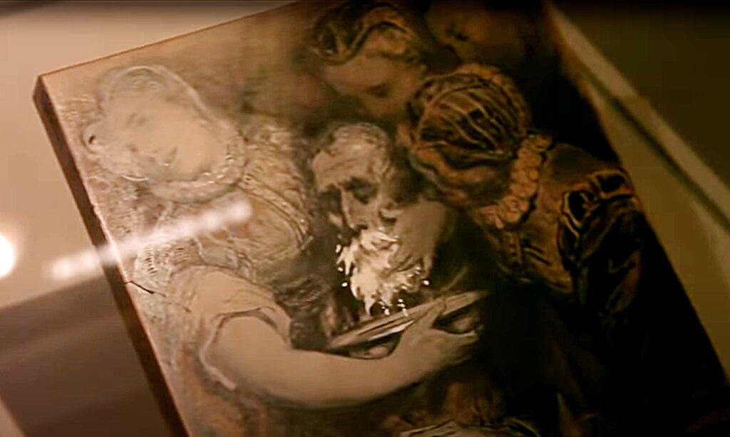
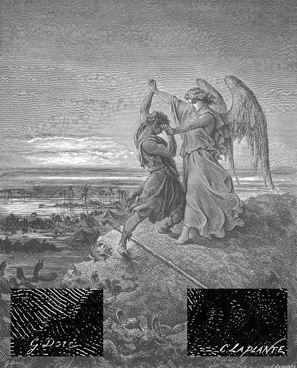
A Breadth of Work Both Fine and Commercial
The Craft of Wood Engraving
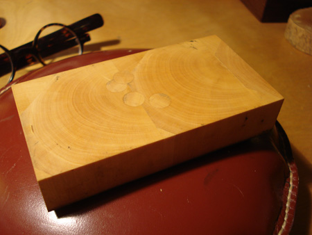
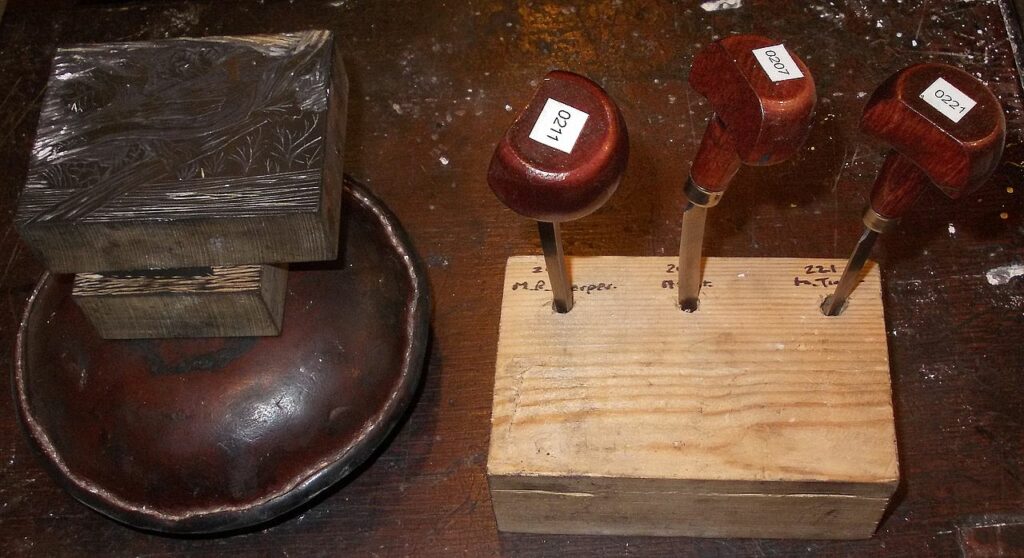
Wood engraving is a form of relief printing, where ink is applied to the surface of a block and directly imprinted on paper. Woodblock printing or linoleum block printing are similar relief forms of printmaking. Wood engraving however, is a much more precise form of relief printing, and therefore could be used to make highly detailed reproductions of paintings and drawings.
There are two features of wood engraving distinct from other forms of relief printing, that make it capable of the fine details needed to reproduce images. First, wood engraving is executed on extremely hard woods (classically boxwood, but today, with boxwood being so rare, maple is used to produce engraving blocks)
Secondly, wood engraving blocks are made by gluing together several pieces of wood orienting each piece so that the end grain of the wood becomes the engraving surface rather than cutting along the plank. As a result cuts can be made in any direction without the risk of breaking off a piece of wood when cutting against the grain. The hardness of the wood, and the ability to cut fine details, made wood engraving the perfect medium for pre-photographic, commercial scale print production.
Other Forms of Printmaking
Wood engraving was used in mass production printing, but there are other forms of printmaking which are much slower to produce, but lend themselves to more robust forms of artistic expression.
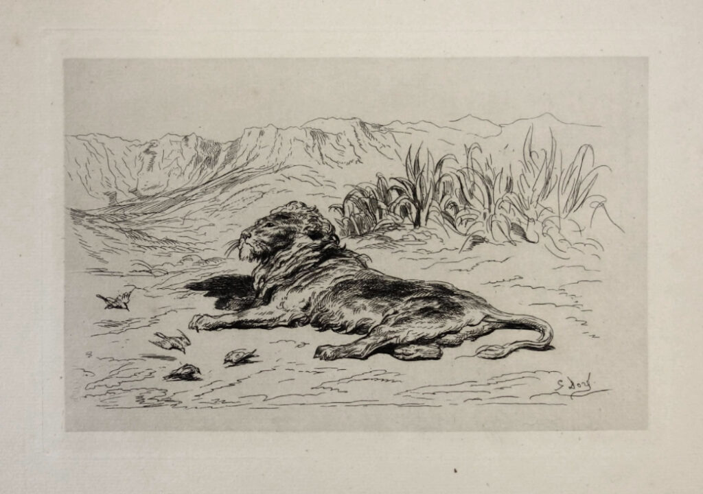
Intaglio printmaking is done using various kinds of metal plates. Lines are cut into the metal, or the surface is etched using chemical processes. Ink is then applied to the entire surface of the metal plate, and then whipped away, the remaining ink is trapped in the groves and textures. The inked plate is then placed on a press, a damped sheet of paper is positioned on top, and then a blanket is placed over both and is pressed under a metal cylinder so that the paper is forced into the groves of the plate where it picks up the ink.
Intaglio printmaking is a much more “painterly” form of printmaking than relief printing. Lines can be built up, textures multiplied. A plate can be etched, printed, and then reworked to darken places, and even lightened by burninsing over areas already etched. And since the process picks ink up from the embedded lines, after the surface ink is whipped away, there always remains some ink residue on the surface which is why the entire image area of an intaglio print has some tone to it, darker than the paper it’s printed on. This feature can likewise be manipulated in the printing process. A printmaker might choose to wipe one area of the plate more thoroughly than other parts, marshalling the residue for artistic effect, essentially painting with the ink.
Creating one intaglio print is a time consuming process, since the plate must be re-inked, wiped, set up and run through the press between each print.
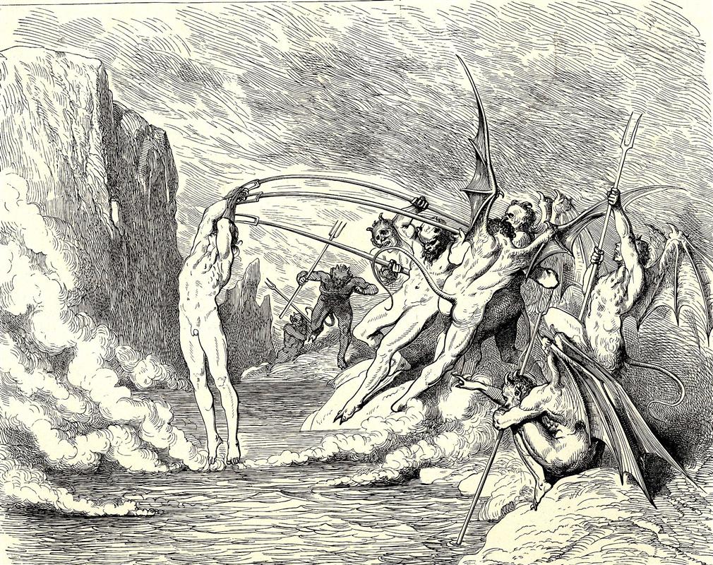
Doré, while most known for his engravings also produced intaglio etchings.
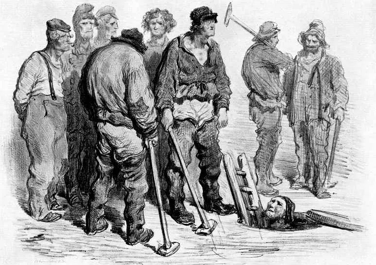
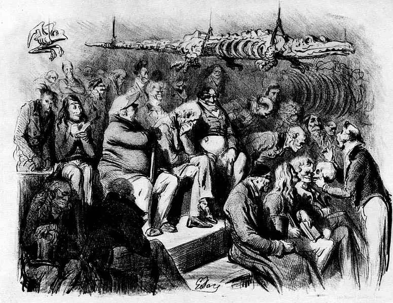
Planography, most commonly in the form of lithography, works on the principle that grease and water resist each other. A lithograph is made by drawing with wax crayons on a litho stone. The stone is then treated with acid such that the grease from the crayon penetrates into the surface of the stone. Later, when ink is applied to the stone, the greasy areas will hold the ink, while the rest of the stone, dampened with water will reject the ink. Paper can then be applied to take the print.
Lithographs look a lot like crayon drawing, since the original crayon marks and textures are directly made to the stone and preserve all their nuanced marks. This makes lithographs a more direct form of reproducing drawings, and allow for more rich textures and tones in the prints.
Doré also produced lithographs, which were sold in galleries and collections, to a limited audience.
Reflections on Engravings as Commercial Reproduction
Have you ever thought about what it would have been like to study art before the days of photographic reproduction?
When I was an art student studying at the Rhode Island School of Design, back in the late 80’s, whenever I needed photographic reference material for a project, I had to head over to the clipping file at the library. First, I’d rifle through the three leaf binder containing the index of subjects available, and then ask the librarian to pull the folder. Soon she would emerge with a manelia pocket full of magazine clippings of giraffes, or wheelbarrows, or boxing gloves, and I’d start looking for just the right image to help me with an illustration.
Fast forward a decade or so and we can find images of absolutely anything with a simple Google search. But even back in my analog image research days, it was still possible for me to get a hold of all sorts of images. Or, if I wanted to study the works of a particular artist I’d just go to the library and look through shelf after shelf of large, beautiful, full-color volumes filled with photographic reproductions of the works of whichever artist I was interested in.
But if we rewind the clock about a hundred and fifty years—how would an art student study the works of the great masters back then? There’s only one Mona Lisa, and if you couldn’t get to France, you were out of luck. If a scholar wanted to study Leonardo, and had the opportunity to travel to see the Mona Lisa, in order to compare that work to others would require quite a bit of travel. And there would be no way to set works alongside each other, for studied comparisons, while moving from one collection to another.
There was, of course, a great appetite to see and enjoy great works of art, but if you could not get to these works, you had to be content with viewing reproductions. By how do you reproduce the Mona Lisa without color photography and four color printing? The basic function of reproducing images, before the age of photography, was the exclusive domain of the engraver. In those days the craft of printmaking was both an artistic medium in its own right, but also a basic commercial technique necessary for any artist’s works to be shared in more than one place at a time.
When I was studying at RISD, my major was illustration, and my medium of choice was wood engraving. But for me wood engraving was a preference—an artform of its own. But prior to the 20th century engraving was primarily a commercial enterprise—the only means of reproducing the art for broader enjoyment.
Back in the 19th century, the tensions between art and commerce were just as real as when I was in art school. As an art student I felt this tension all the time. There is an unspoken hierarchy in the art school experience between the departments. A ranking based on the supposed purity of artistic expression. Fine arts such as painting and sculpture were at the top, graphic design and industrial design toward the bottom, and illustration somewhere in the middle. Nobody gave voice to this hierarchy, and every department was deeply invested in the craft and discipline of design, whether commercially oriented or not. Nevertheless this hierarchy hung in the air. As students wrestled with their choice of major during freshmen foundation, these feelings often emerged. Justified or not, many of those leaning toward graphic design, felt at some level that they might be selling their talents out.
This was, and is, a modern manifestation of the same tensions that existed in and around the world of printmaking in the 19th century. As Steven Bann points out in his fascinating book “Parallel Lines” the “truc,” that is the commercial bargains involved in the printmaking industry were full of such tensions. On the one hand it’s perfectly understandable for an artist to look upon even a masterful black and white reproduction of his work with deep criticism and great sense of loss. How could cold black and white lines capture the textures, the richness, nevermind the color of the original?
Yet, without lithographs or engravings, their masterpieces would be resigned to limited local exposure.
The story of Gustave Doré and his work is a perfect vignette for exploring some of these tensions. As an illustration major, focused on wood engraving, I of course became aware of Doré’s work. I marvelled at it for its brilliance of imagination, it’s amazing draughtsmanship, and of course for the technical skill manifest in the engravings themselves.
Since his illustrations were meant for mass market publications, it was mechanically necessary for his drawings to be produced as engravings, so that they could be locked up in a chase and printed along with the metal type used to print the text.
But even though his illustrations were made from the start to become engravings, the process of converting his original drawings into cut blocks always disturbed him. Especially since quite often the actual process of engraving was performed by a tradesmen, not by Doré himself. This lossy transformation bothered him so much that he would often take photographs of his drawings made directly on the wood block, to preserve the original before it was eradicated by the engraving process.
For me, when I marvel at a Doré print, I appreciate the amazing craftsmanship of the engraving technique just as much as I do the creativity and execution of the image itself.
Today, that heightened skill of engraving, which was needed to reproduce images in the 19th century, is gone. Those who produce wood engravings today don’t struggle with the tensions between original and reproduction the way artists such as Doré did in the 19th century. Today, the engraving is the original form of art. But I can’t help feeling at times that this freedom engravers enjoy today—to pursue engraving as an original form of artistic expression, has lost something from its heritage as tradecraft, even as it’s gained something in its freedom.
Explore the Imagination of Gustave Doré.
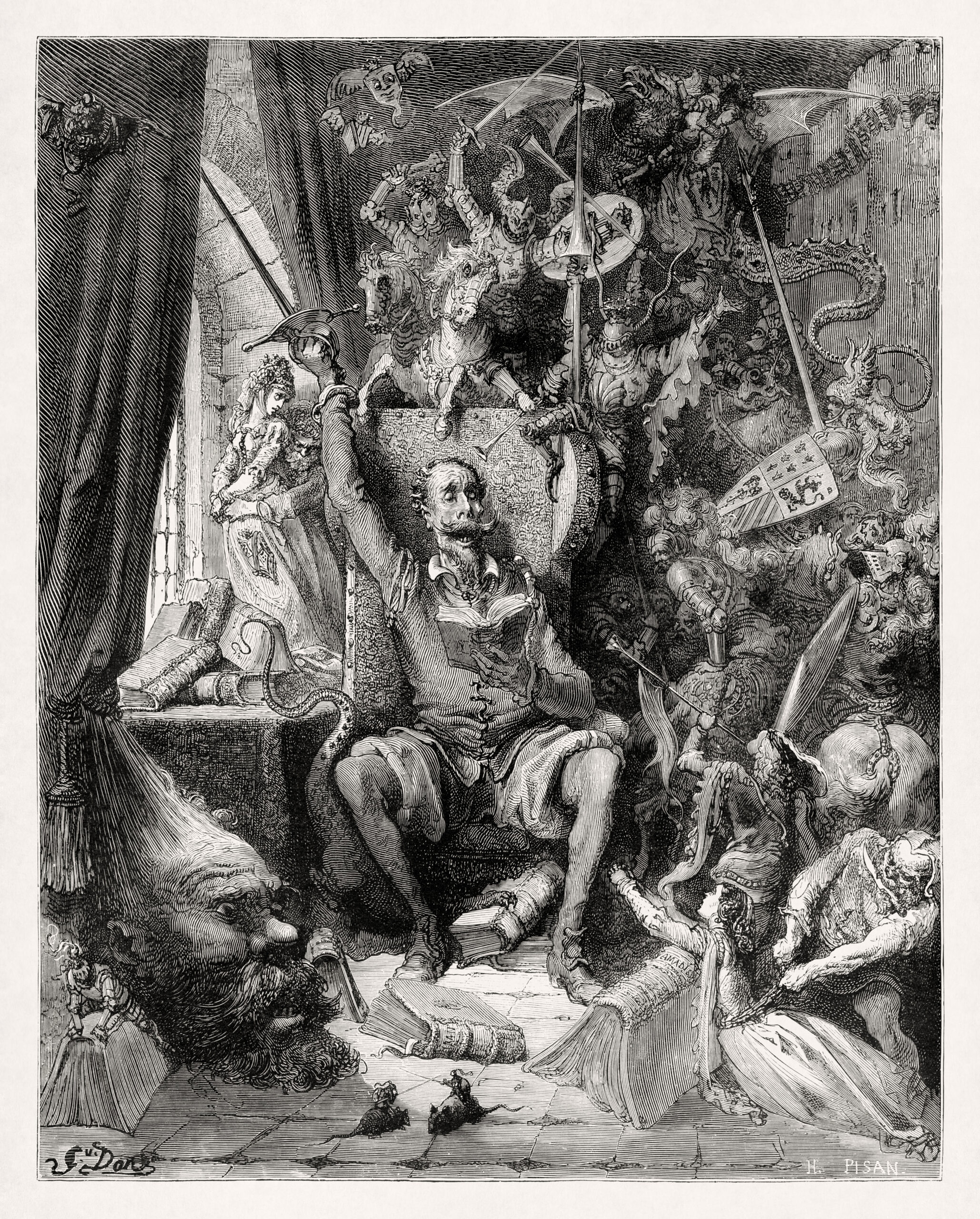
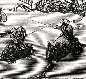
Gustave Doré’s illustration of Cervantes, which accompanies his illustrations for Don Quixote, is packed full of imaginative details. Examine some of these below, or explore this image yourself!
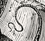
LEVEL OF DETAIL
Doré’s illustrations are packed full of imaginative detail. Here in the shadows he fills with subtle details of the faces from Cervantes’ Don Quixote.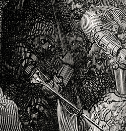
Bibliography and Additional Resources
- Kaenel, Philippe, (Ed.). (2014). Gustave Doré (1832-1883) Master of Imagination. Musee d’Orsay / Flammarion / National Gallery of Canada.
- Bann, Stephen. (2001). Parallel Lines. Yale University Press

